
Library of Mapped Data Images


< Return to BIO Curriculum Step 1: Observation and Discussion
< Return to BIO Curriculum Step 3: Data Sketches
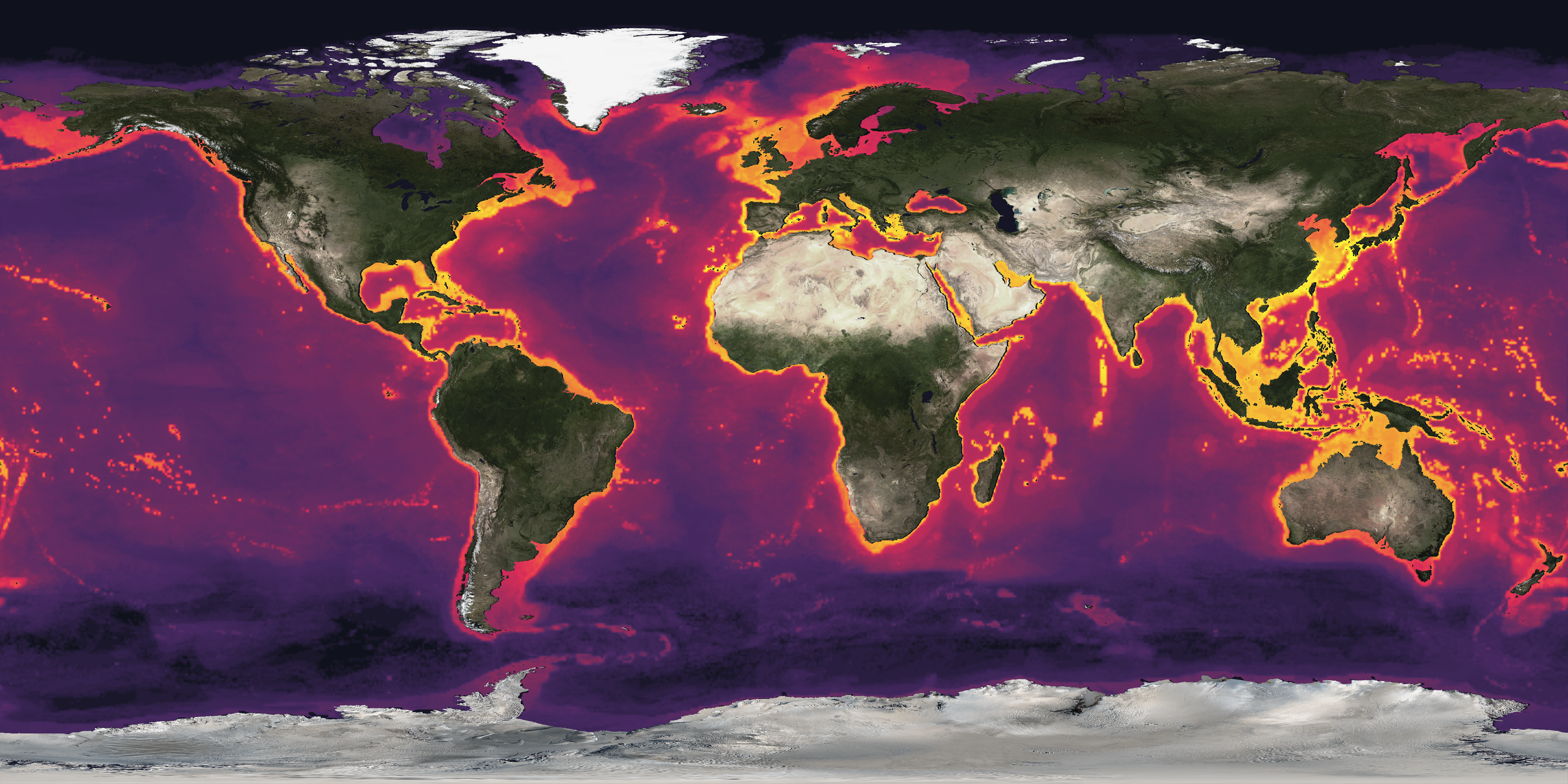
Age the of Seafloor
Title: Age of the Seafloor
The surface of the Earth is composed of a mosaic of tectonic plates with edges that create fault lines. The Earth's crust is made of seven major plates and several smaller plates. As the plates move, new sea floor can be created. The plates form three different kinds of boundaries: convergent, divergent, and transform. Convergent boundaries are also called collision boundaries because they are areas where two plates collide. At transform boundaries, the plates slide and grind past one another. The divergent boundaries are the areas where plates are moving apart from one another. Where plates move apart, new crustal material is formed from molten magma from below the Earth's surface. Because of this, the youngest sea floor can be found along divergent boundaries, such as the Mid-Atlantic Ocean Ridge. The spreading, however, is generally not uniform causing linear features perpendicular to the divergent boundaries, shown in this dataset as contour lines. This dataset shows the age of the ocean floor with the lines or contours of 5 million years as shown in the colorbar. Plate names and plate boundaries are available as layers but must be turned on to appear. The data is from four companion digital models of the age, age uncertainty, spreading rates and spreading asymmetries of the world's ocean basins. Scientists use the magnetic polarity of the sea floor to determine the age. Very little of the sea floor is older than 150 million years. This is because the oldest sea floor is subducted under other plates and replaces by new surfaces. The tectonic plates are constantly in motion and new surfaces are always being created. This continual motion is evidenced by the occurrence of earthquakes and volcanoes. Dataset Sources: NOAA Science On a Sphere, NOAA NCEI Applicable Metadata: Category: Plate Tectonics, Ocean Related Lessons/Units: Related Data: Link(s)- earthquakes, volcano locations, plate boundaries Link to Source: NOAA Science On a Sphere Dataset Catalog 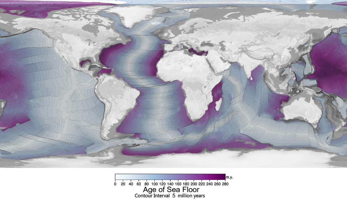
Map - 4096x2046
Colorbar
Map with colorbar - 4096x2046
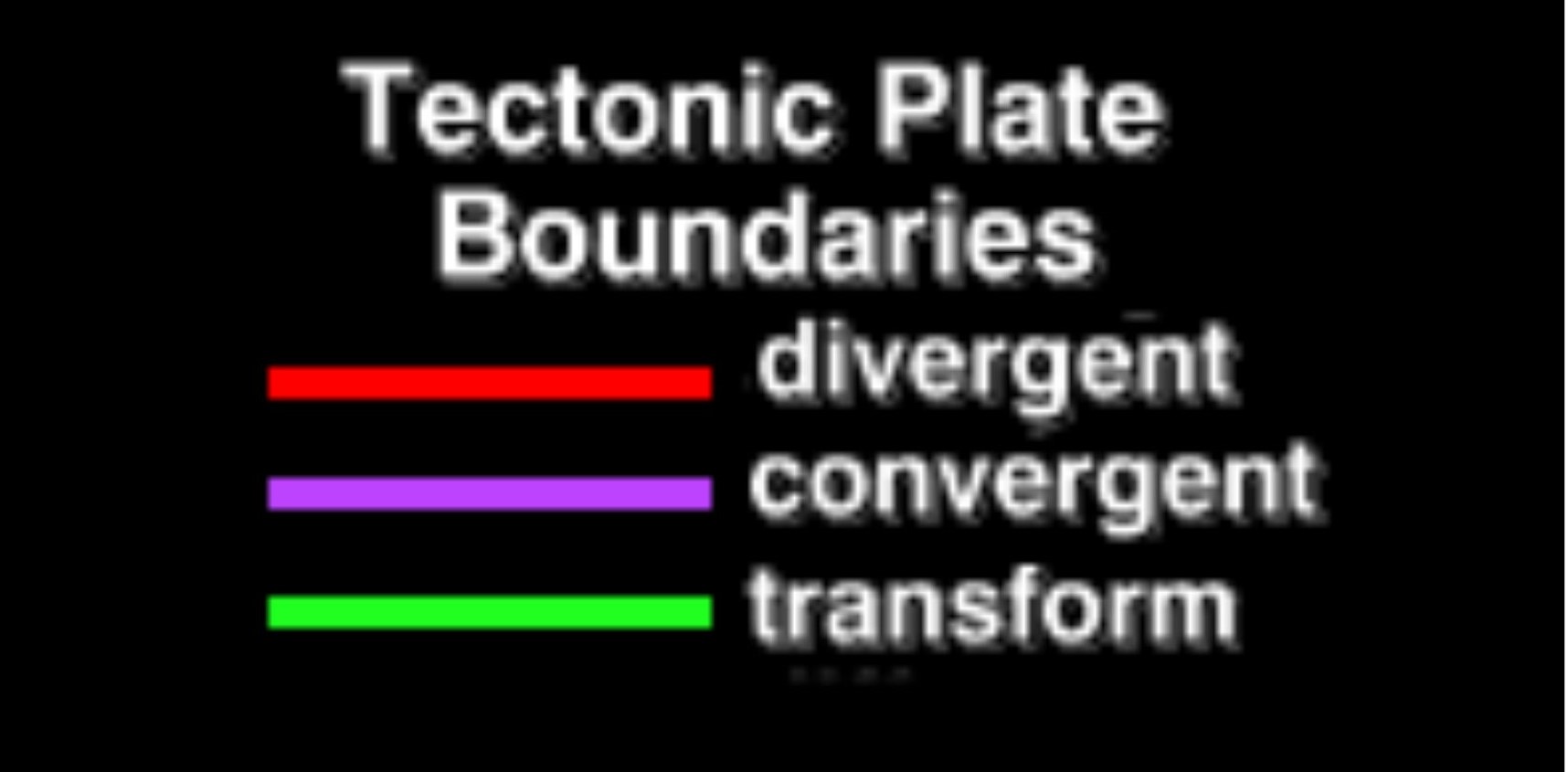
Plate Boundaries - Colorized
Title: Plate Boundaries - Colorized
Earth’s outer surface is like a jigsaw puzzle, made up of about 20 tectonic plates that fit together and meet at plate boundaries. These boundaries are crucial because they are often sites of earthquakes and volcanoes. When tectonic plates grind past each other, the resulting friction can cause earthquakes. Volcanoes frequently form near plate boundaries due to magma rising from deep within the Earth. There are three main types of plate boundaries: A single tectonic plate can interact with multiple other plates, leading to various boundary types. For instance, the Pacific Plate includes convergent, divergent, and transform boundaries. Map Layer, Title and Colorbar Dataset Sources: Applicable Metadata: Category: Earthquakes, Volcanoes, Plate Boundaries, Seafloor Related Lessons/Units: Plate Tectonics: Plate Boundaries, Earthquakes, and Volcanoes Related Data: Link(s)- (TBD) Link to Source: NOAA Science On a Sphere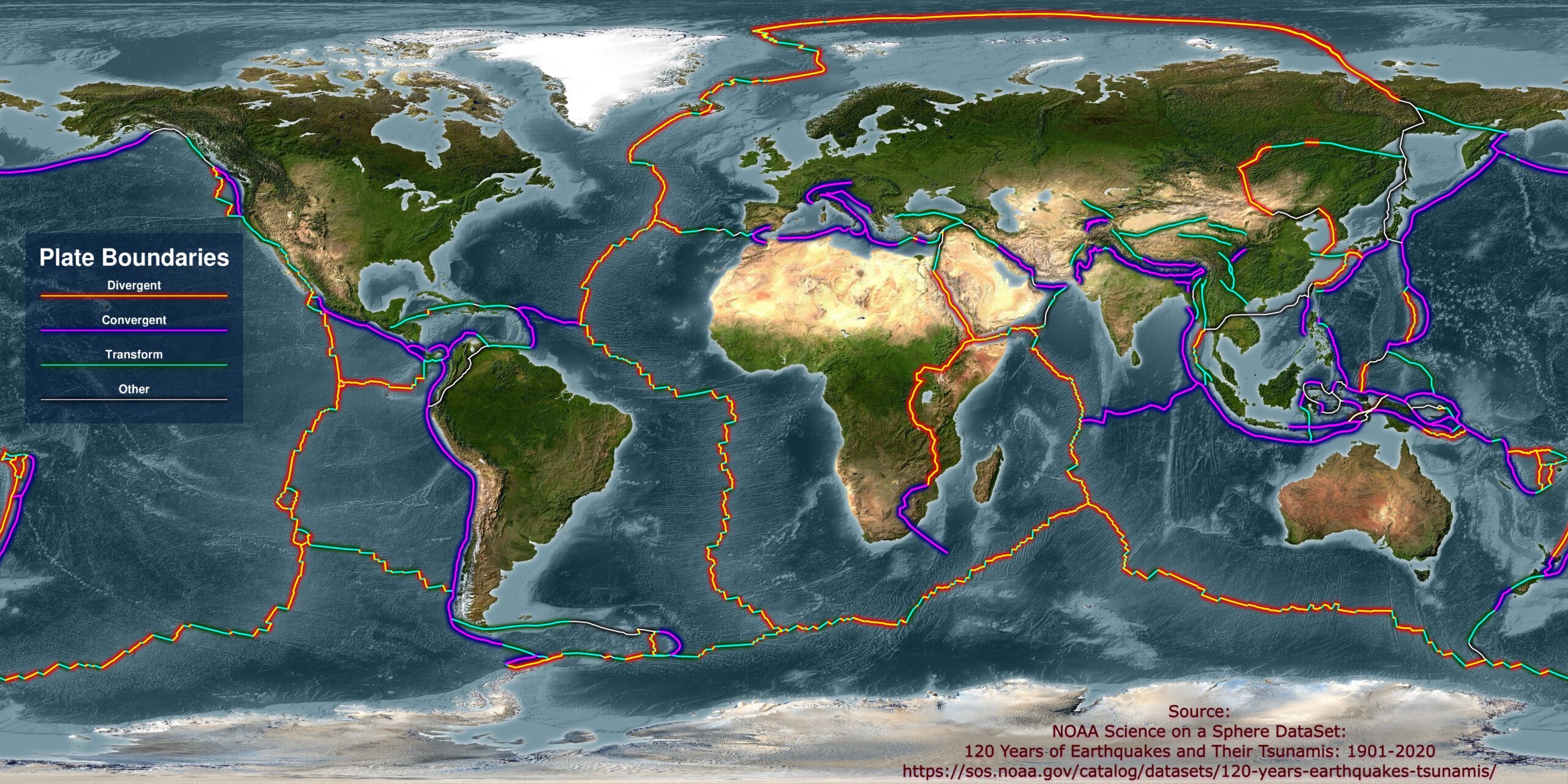
Plate Boundary transparent layer
Legend
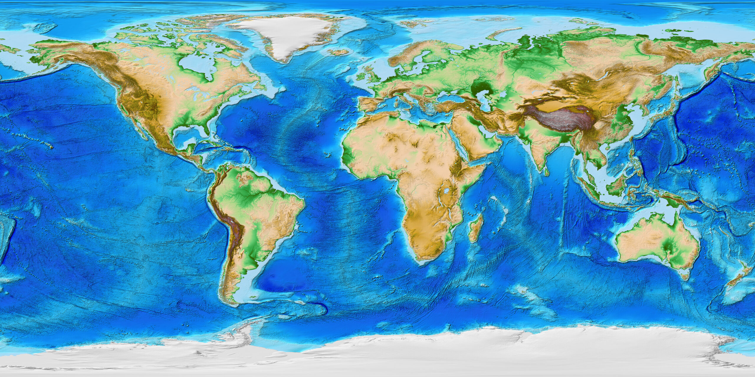
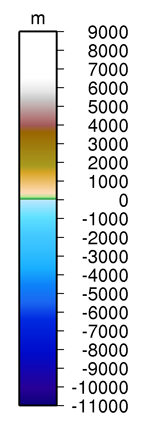
Topography and Bathymetry
Title: Topography and Bathymetry
This map is a relief model of Earth's surface that integrates land topography and ocean bathymetry. It was built from numerous global and regional data sets. Scientists use high resolution maps like this to improve accuracy in tsunami forecasting, modeling, and warnings, and also to enhance ocean circulation modeling and Earth visualization. Lights sparkle across the dark planet, tracing roads and political boundaries, revealing areas where use of electric power is expanding and those where storms have knocked out power, and highlighting the locations of brightly-lit fishing fleets. It is possible to detect clouds illuminated by moonlight, lights from cities and towns, industrial sites, gas flares, fires, lightning, and aurora. This remarkable view of our planet comes from an instrument on the NOAA-NASA Suomi National Polar-orbiting Partnership (NPP) satellite, and is the result of careful work by scientists and visual experts at the two agencies and academic collaborators. Map - 4096 x 2048 Dataset Sources: NOAA NCEI Applicable Metadata: Category: Plate Tectonics, Elevation, Seafloor Related Lessons/Units: Earth's Changing Atmosphere: Human Impacts and Climate Change Related Data: Link(s)- (TBD) Link to Source: NOAA Science On a Sphere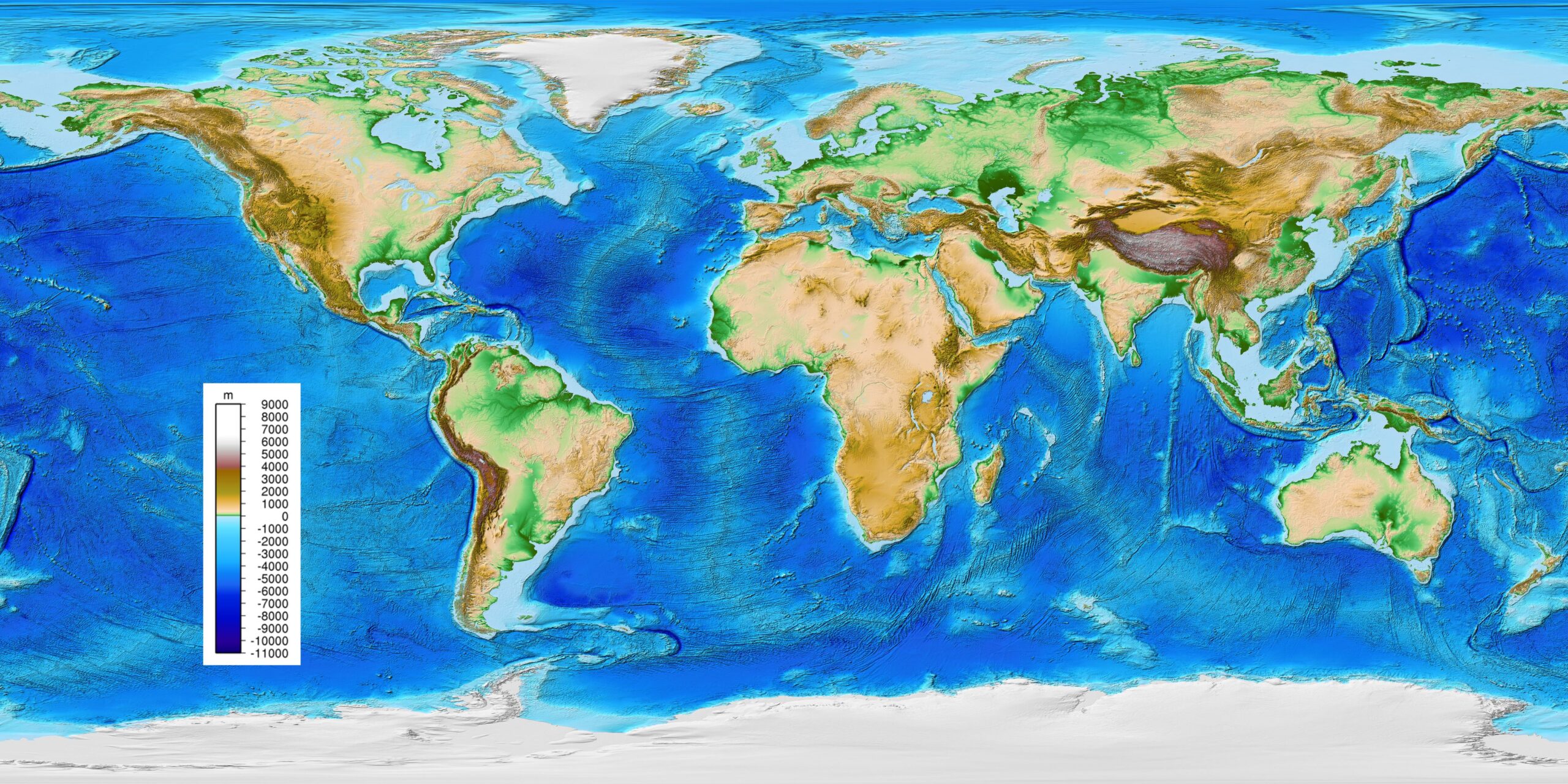
Map with Colorbar
Colorbar
Earthquakes 6.5 or greater between 2001 - 2015
Title: Earthquakes 6.5 or greater between 2001 - 2015
This map recorded earthquake shows earthquake magnitude and depth between January 1, 2001, through December 31, 2015, highlighting only those earthquakes greater than magnitude 6.5. The size of the circle represents the earthquake magnitude while the color represents its depth within the earth. Earthquakes most likely to pose a tsunami threat when they occur under the ocean or near a coastline and when they are shallow within the earth (less than 100 km or 60 mi. deep). This time period includes some remarkable events. Several large earthquakes caused devastating tsunamis, including 9.1 magnitude in Sumatra (26 December 2004), 8.1 magnitude in Samoa (29 September 2009), 8.8 magnitude in Chile (27 February 2010), and 9.0 magnitude off of Japan (11 March 2011). Like most earthquakes these events occurred at plate boundaries, and truly large events like these tend to occur at subduction zones where tectonic plates collide. You can view a YouTube version of this animation of this dataset here. Map with Colorbar and Title Dataset Sources: NOAA Tsunami Warnings Applicable Metadata: Category: Plate Tectonics, Earth Science, Tsunamis Related Lessons/Units: Plate Tectonics: Plate Boundaries, Earthquakes, and Volcanoes Related Data: Link(s)- (TBD) Link to Source: NOAA Science On a Sphere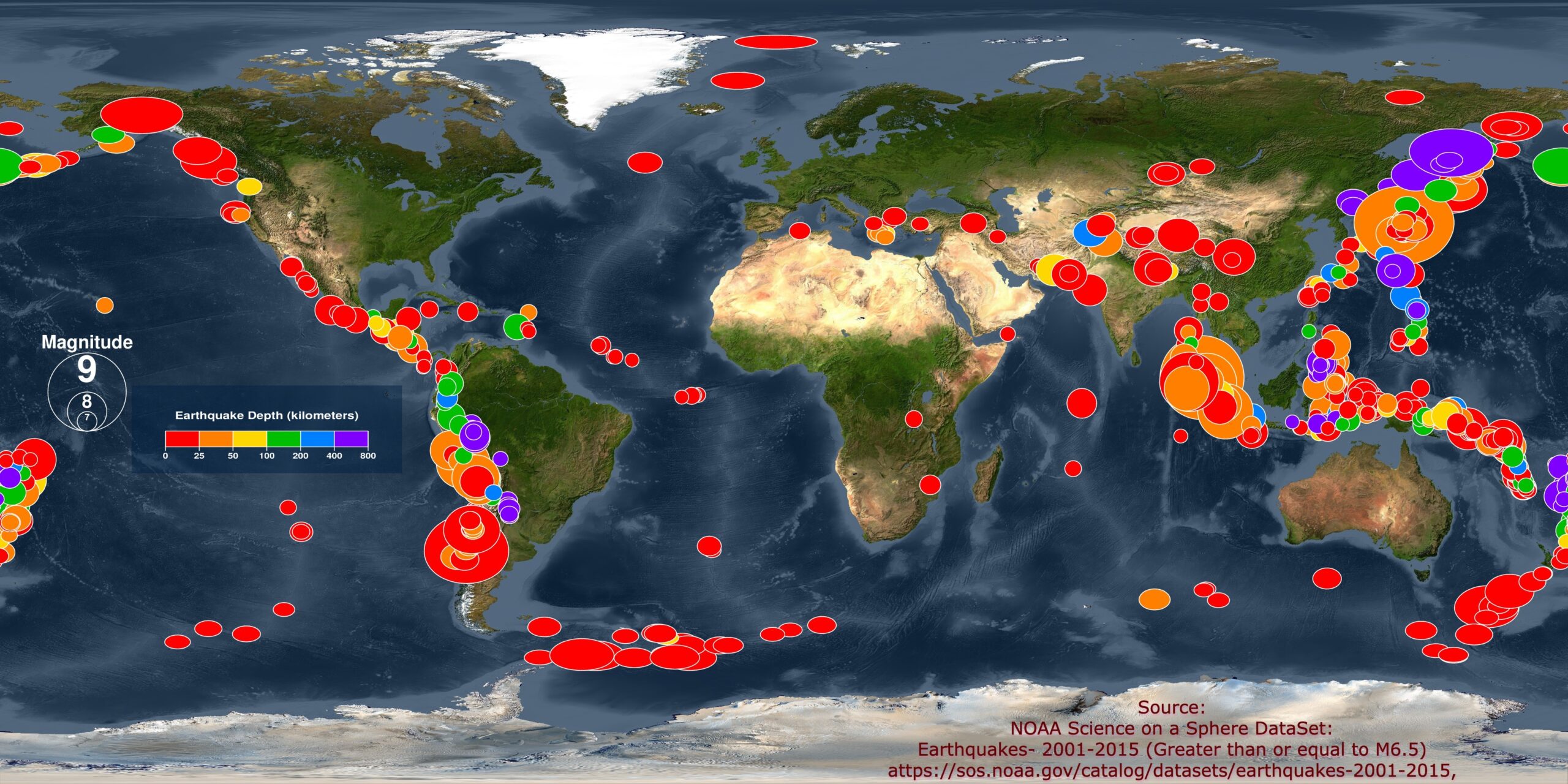
Colorbar
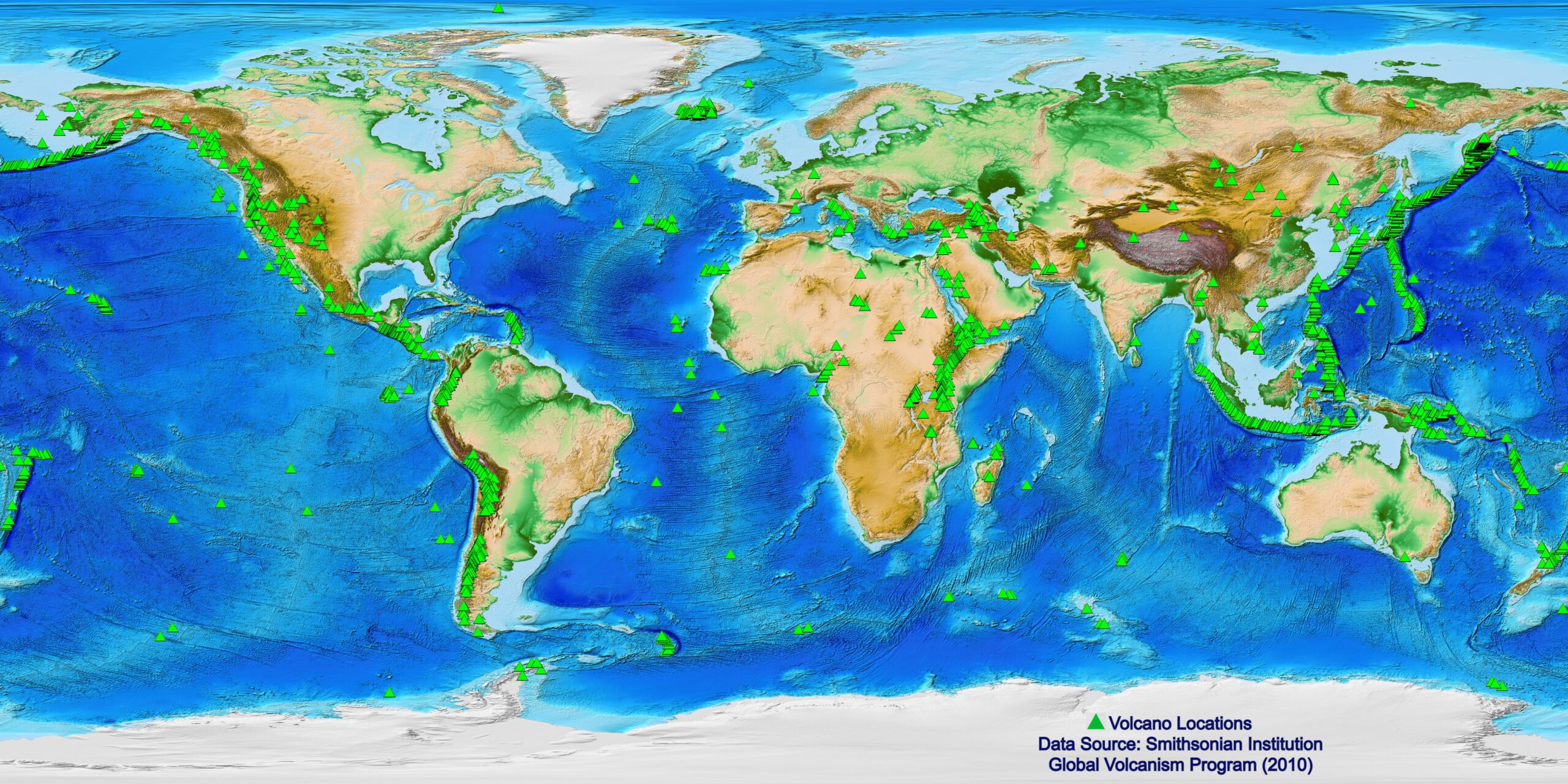
Global Volcano Locations
Title: Global Volcano Locations
According to the Smithsonian Institute's Global Volcanism Program, there are probably about 20 volcanoes erupting right now, and about 550 volcanoes have had historically documented eruptions. A volcano is an opening, or rupture, in the Earth's crust through which molten lava, ash, and gases are ejected. Volcanoes typically form in three different settings. The first is divergent plate boundaries, where tectonic plates are pulling apart from one another, such as the Mid-Atlantic Ocean Ridge. Most of these volcanoes are on the bottom of the ocean floor and are responsible for creating new sea floor. The second location is convergent plate boundaries, where two plates, typically an oceanic and continental plate, are colliding. The volcanoes along the Pacific Ring of Fire are from convergent plate boundaries. The third location is over hotspots, which are typically in the middle of tectonic plates and caused by hot magma rising to the surface. The volcanoes on Hawaii are the result of hotspots. There are three datasets for Science On a Sphere that highlight global volcano locations. This dataset, compiled by the Smithsonian Institute's Global Volcanism Program, shows the locations of current and past activity for all volcanoes on the planet active during the last 10,000 years. The other two datasets are from the National Geophysical Data Center's Significant Volcanic Eruption Database. The Volcano Eruptions dataset, shows the locations of significant eruptions, of which there are over 400. An eruption is considered significant if there are any fatalities linked to it, the cost of the damage is over one million dollar, it causes a tsunami, or there is a major earthquake associated with it. The final dataset, Volcano Eruptions causing Tsunamis , illustrates the locations of all eruptions that have caused tsunamis. Volcanoes with Topography and Bathymetry Basemap and Title Dataset Sources: Smithsonian Global Volcanism Program Applicable Metadata: Category: Plate Tectonics, Earth Science Related Lessons/Units: Plate Tectonics: Plate Boundaries, Earthquakes, and Volcanoes Related Data: Link(s)- (TBD) Link to Source: NOAA Science On a Sphere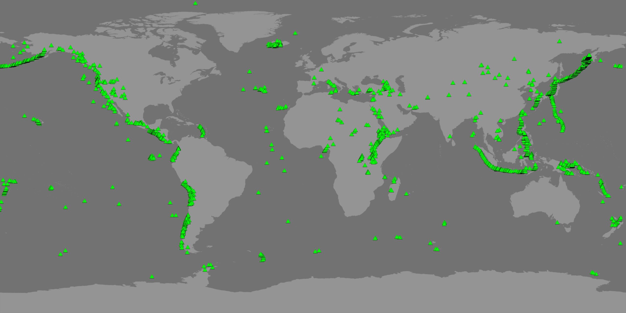
Volcanoes with Topography and Bathymetry Basemap
Transparent volcano layer
Volcanoes with Gray basemap
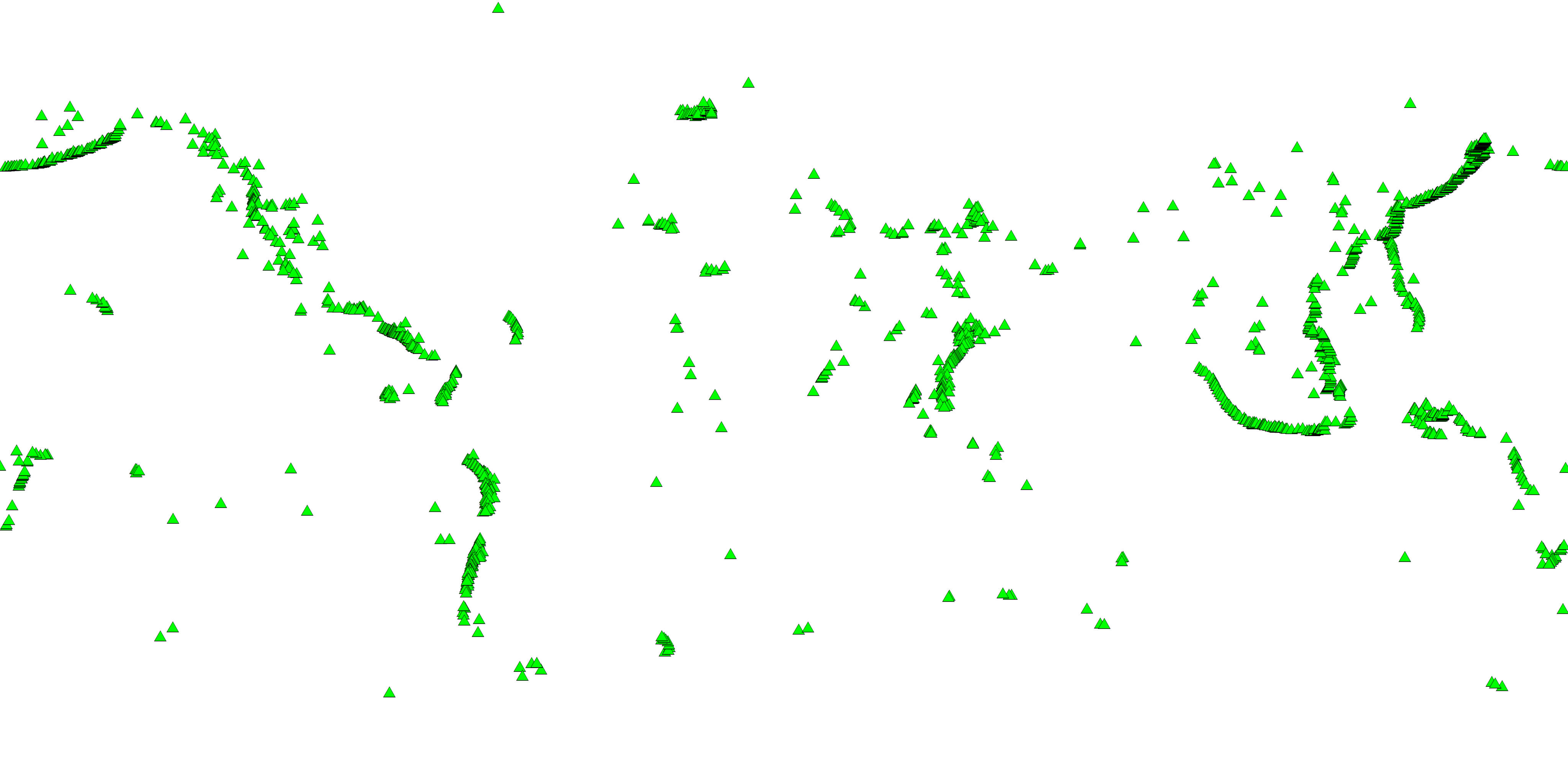
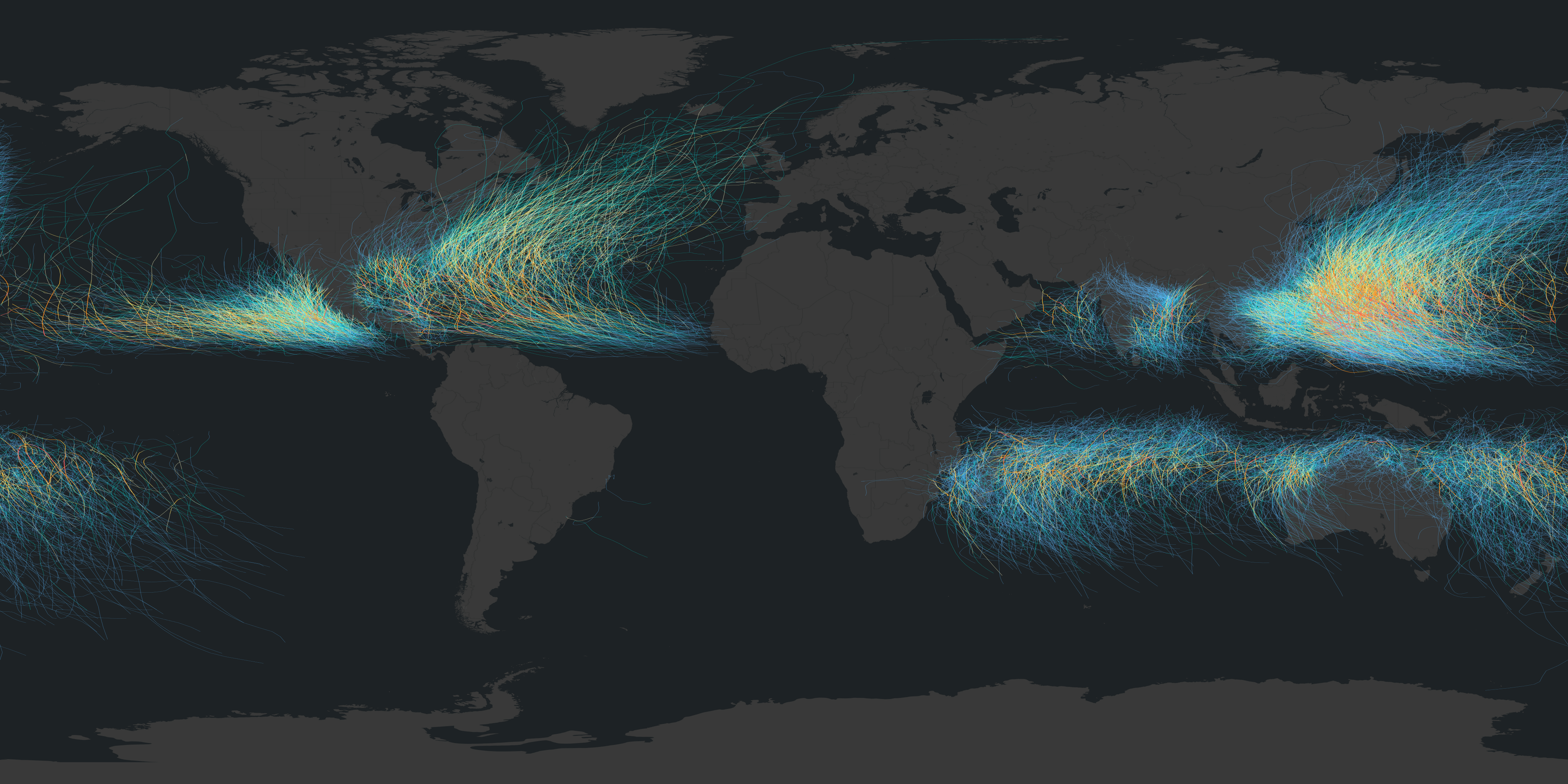
Hurricane Tracks
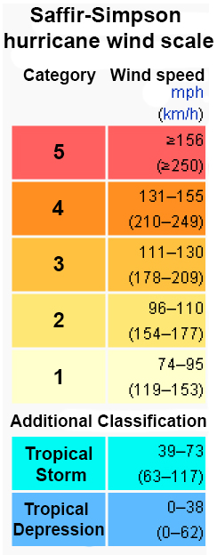
Title: Hurricane Tracks
Tracking historical hurricanes is an important way for hurricane researchers to learn about the paths of future hurricanes. Because of this, records of hurricane paths are archived and studied. Not all hurricanes follow the same path, but there are certainly noticeable trends for hurricane paths. Many computer models that have been created to predict hurricane paths include the historical data in their models. This dataset shows the paths of all tropical cyclones from 1950 through 2020. Each line is a tropical cyclone, whether a tropical depression or tropical storm (blue, cyan) or hurricane (yellow to red). The maximum sustained wind speed, with cool colors for slower speeds and warm colors for faster speeds, are indicated by the colorbar. When mapped like this, definite patterns in cyclone paths are clear to see. For example, you can see that cyclones typically start near the equator and move away from it toward the poles and they don't cross the equator. Want to learn about a specific hurricane that affected you or someone you know? Check out this Historical Hurricanes site. Dataset Sources: NOAA NCEI Applicable Metadata: Category: Weather, Hurricanes Related Lessons/Units: Earth's Changing Atmosphere: Human Impacts and Climate Change Related Data: Link(s)- (TBD)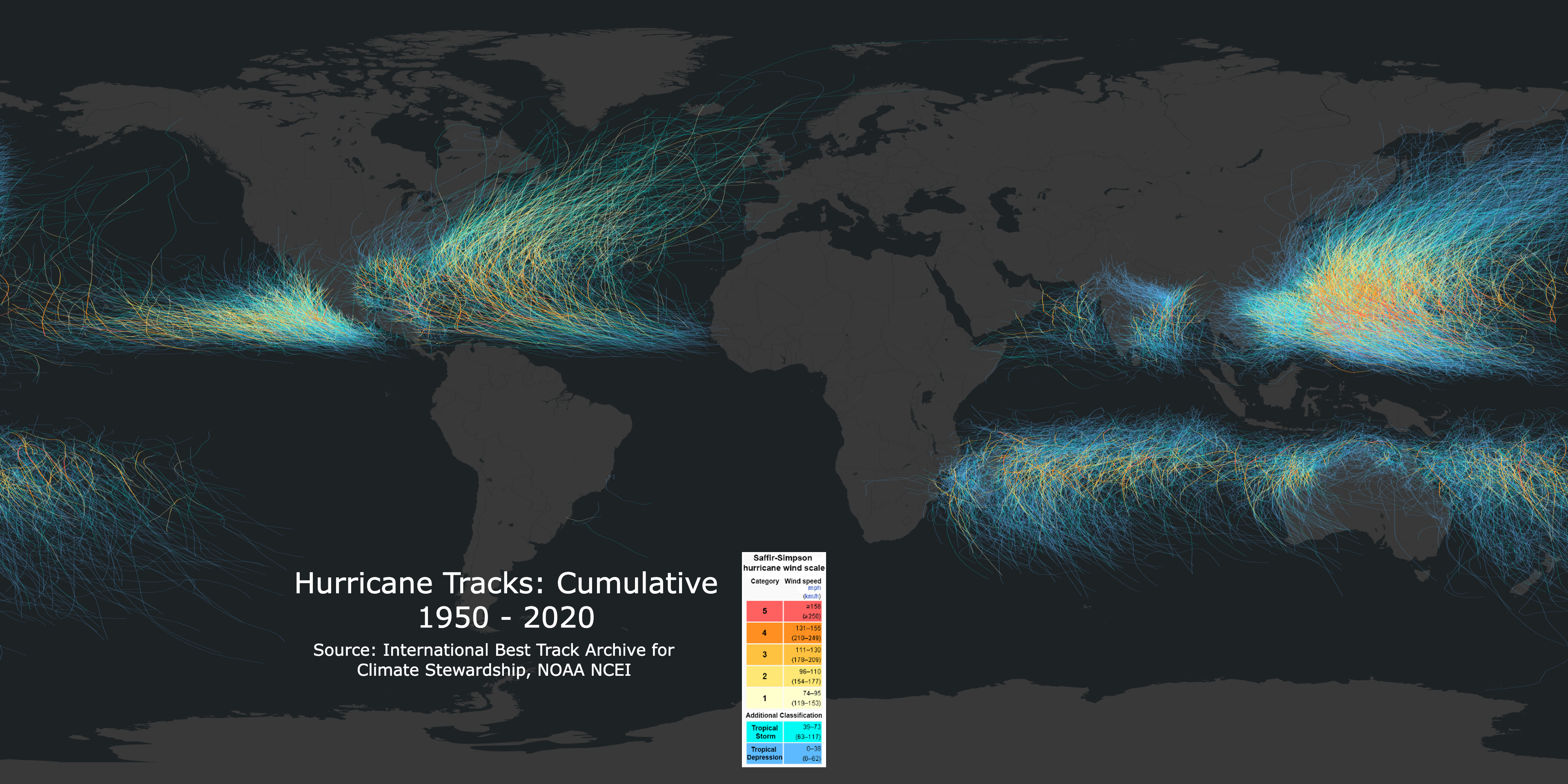
Map
Map with Legend
Legend
Link to Source: NOAA Science On a Sphere
Precipitation Ranking: U.S. - 2023
Title: Precipitation Ranking: U.S. - 2023
This dataset shows how 2023 ranks in precipitation amounts for each of the continental U.S. states out of 129 years. Dataset Sources: NOAA NCEI Applicable Metadata: Category: Precipitation, Climate, Climate Change, Weather Related Lessons/Units: Drought: Examining the Causes and Effects of Precipitation Shortage Related Data: Link(s)- (TBD) Link to Source: NOAA NCEI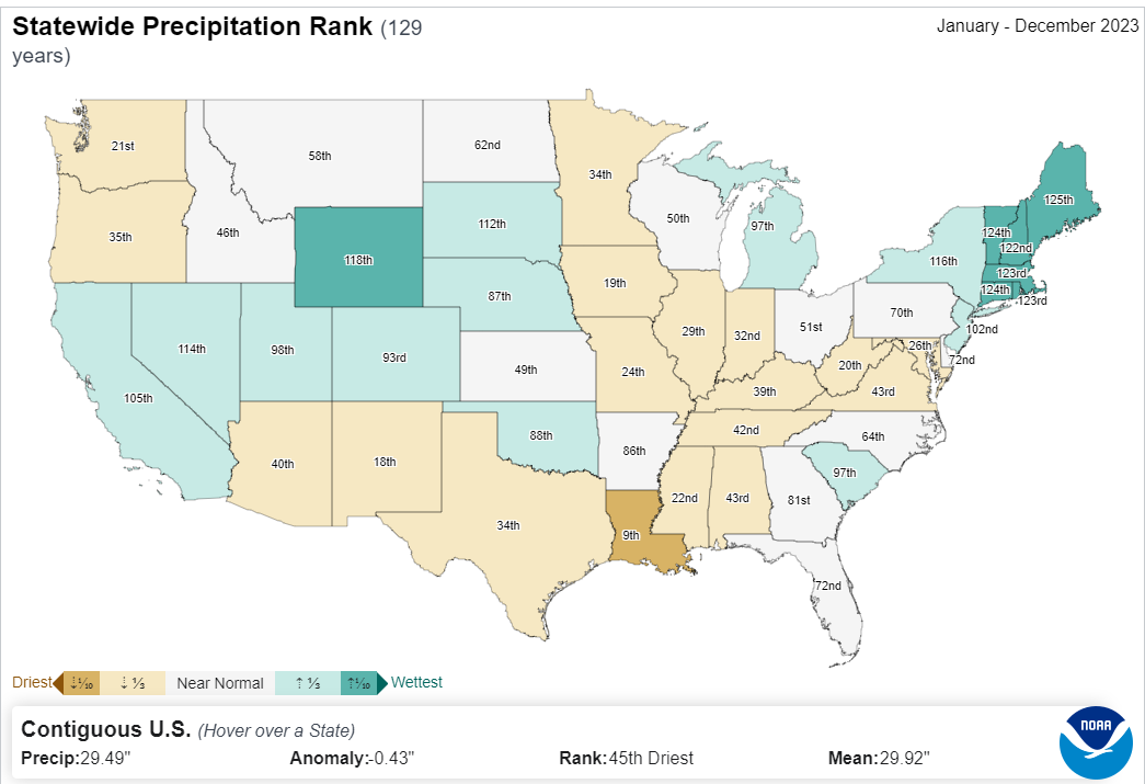
Map
Map with Legend
Temperature Maximum Ranking: U.S. - 2023
Title: Temperature Maximum Ranking: U.S. - 2023
The surface of the Earth is composed of a mosaic of tectonic plates with edges that create fault lines. The Earth's crust is made of seven major plates and several smaller plates. As the plates move, new sea floor can be created. The plates form three different kinds of boundaries: convergent, divergent, and transform. Convergent boundaries are also called collision boundaries because they are areas where two plates collide. At transform boundaries, the plates slide and grind past one another. The divergent boundaries are the areas where plates are moving apart from one another. Where plates move apart, new crustal material is formed from molten magma from below the Earth's surface. Because of this, the youngest sea floor can be found along divergent boundaries, such as the Mid-Atlantic Ocean Ridge. The spreading, however, is generally not uniform causing linear features perpendicular to the divergent boundaries, shown in this dataset as contour lines. This dataset shows how 2023 ranks in statewide maximum temperature for each of the continental U.S. states out of 129 years. Dataset Sources: NOAA Science On a Sphere, NOAA NCEI Applicable Metadata: Category: Plate Tectonics, Ocean Related Lessons/Units: Drought: Examining the Causes and Effects of Precipitation Shortage Related Data: Link(s)- earthquakes, volcano locations, plate boundaries Link to Source: NOAA Science On a Sphere Dataset Catalog 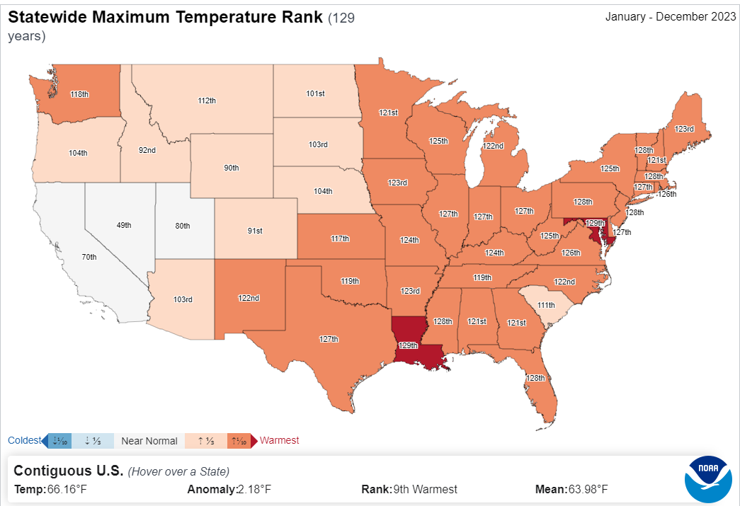
Map
Map with Legend
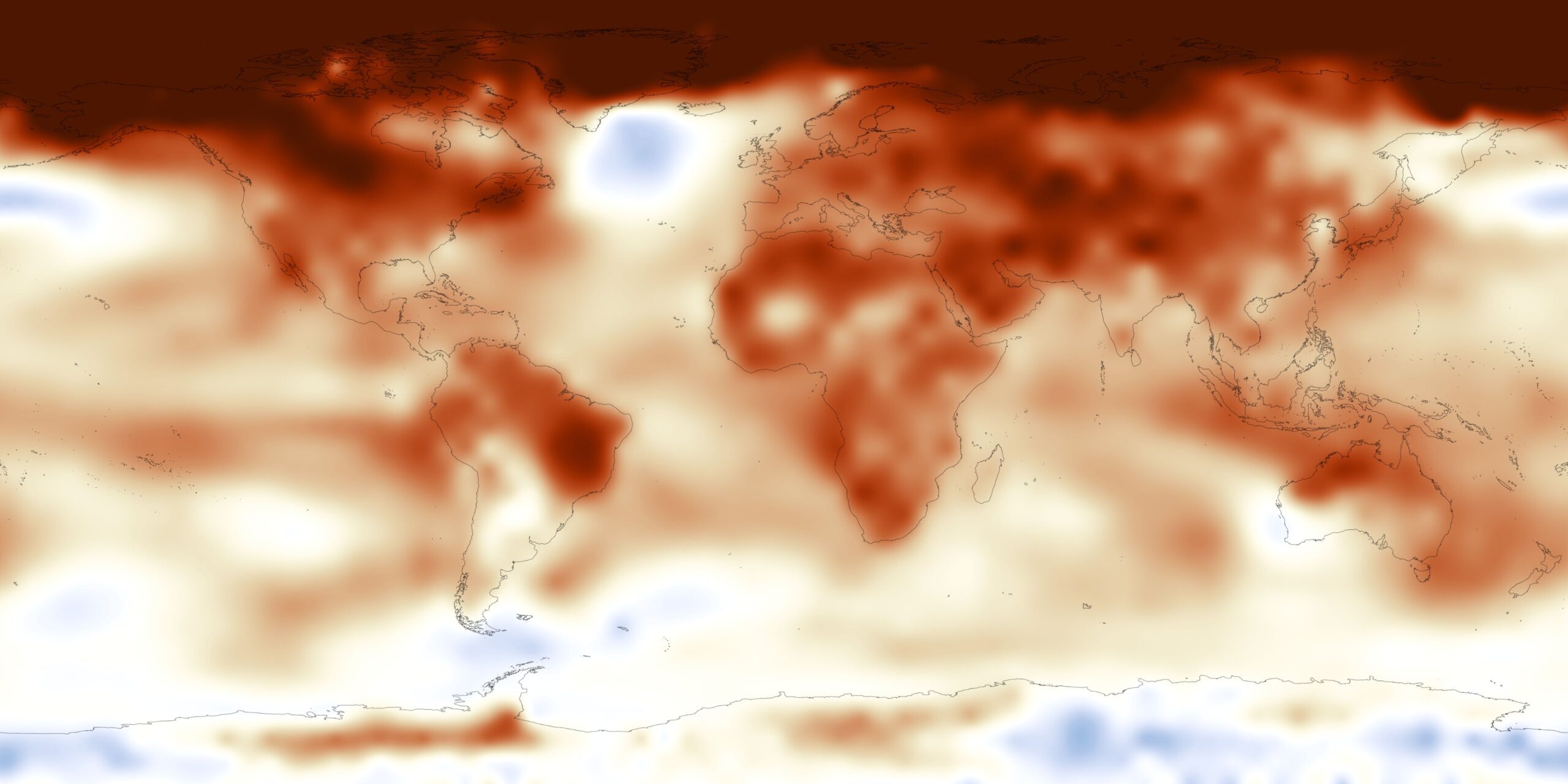
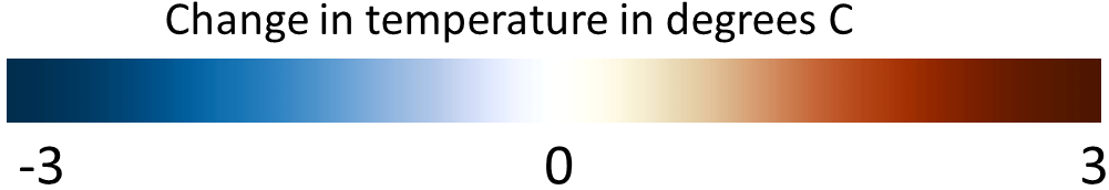
Temperature Anomaly - Annual Average
Title: Temperature Anomaly - Annual Average
By averaging data over long time spans, typically 30 years or more, climatology datasets are developed. These datasets serve as reference points for comparing points in time to what would be expected. For example, is the temperature warmer or cooler last year than would be expected from the historical average? Temperature climatologies are extremely important as measurements, models, and reconstructions of Earth's temperature changes are analyzed. The Merged Land-Ocean Surface Temperature Analysis from the National Centers for Environmental Information (NCEI) uses data from thousands of land and ocean temperature stations worldwide to compute global temperature averages and anomalies. The majority of these locations date back to the 1950's. This dataset shows annual global temperature anomalies in 2016 compared to the 20th century average. Blue areas are cooler than the historical average, red areas are warmer. Go to NOAA View to view any year since 1850. For more information on NCEI's temperature climate analysis, visit the NCEI Climate Monitoring page. Dataset Sources: NOAA National Centers for Environmental Information Applicable Metadata: Category: Temperature, Climate Change, Weather, Climate Related Lessons/Units: Mapping Human Impacts: Human Activity and the Environment Related Data: Link(s)- (TBD) Link to Source: NOAA Science On a Sphere, NOAA View Global Data Explorer 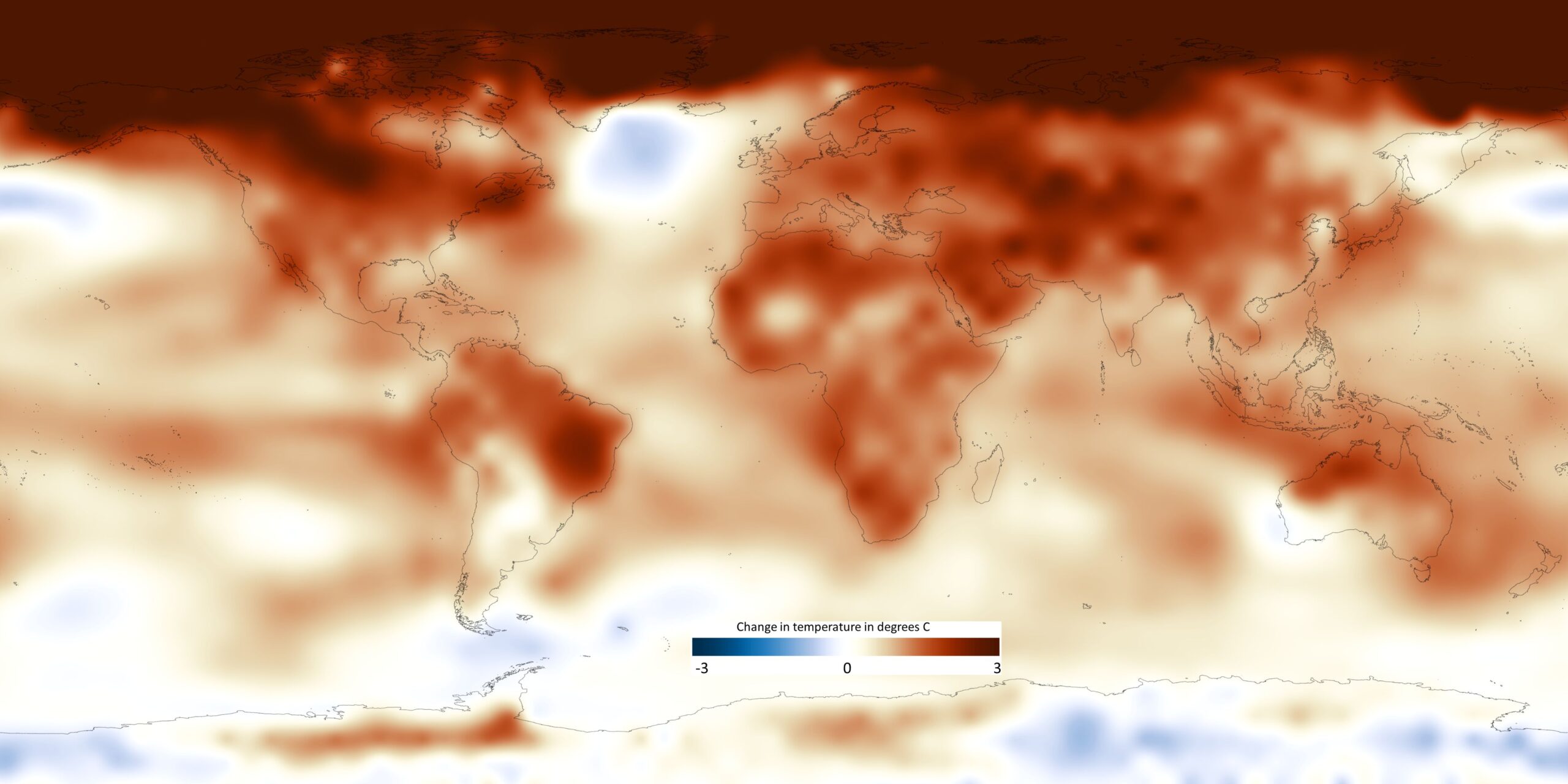
Map - 4096x2048
Colorbar
Map with colorbar
Black Country Borders layer
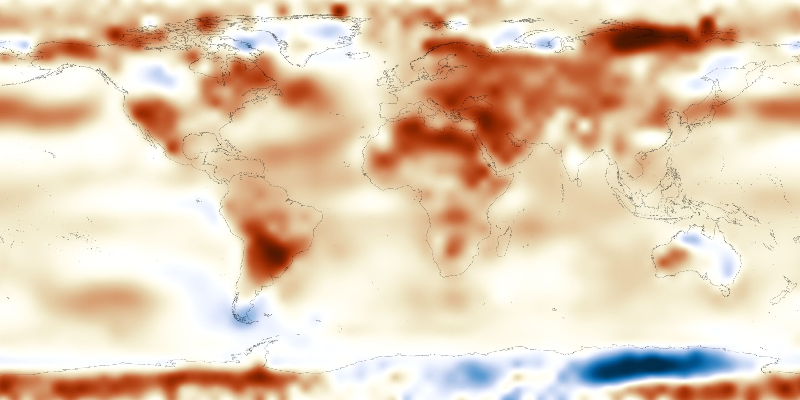
Temperature Anomaly - Monthly Average
Title: Temperature Anomaly - Monthly Average
By averaging data over long time spans, typically 30 years or more, climatology datasets are developed. These datasets serve as reference points for comparing points in time to what would be expected. For example, is the temperature warmer or cooler this month than would be expected from the historical average? Temperature climatologies are extremely important as measurements, models, and reconstructions of Earth's temperature changes are analyzed. The Merged Land-Ocean Surface Temperature Analysis from the National Centers for Environmental Information (NCEI) uses data from thousands of land and ocean temperature stations worldwide to compute global temperature averages and anomalies. The majority of these locations date back to the 1950's. This dataset shows monthly global temperature anomalies over the past year compared to the 20th century average. Blue areas are cooler than the historical average, red areas are warmer. For more information on NCEI's temperature climate analysis, visit the NCEI Climate Monitoring page. Map - 4096 x 2048 Dataset Sources: NOAA National Centers for Environmental Information Applicable Metadata: Category: Temperature, Climate Change, Weather, Climate Related Lessons/Units: Mapping Human Impacts: Human Activity and the Environment Related Data: Link(s)- (TBD) Link to Source: NOAA Science On a Sphere, NOAA View Global Data Explorer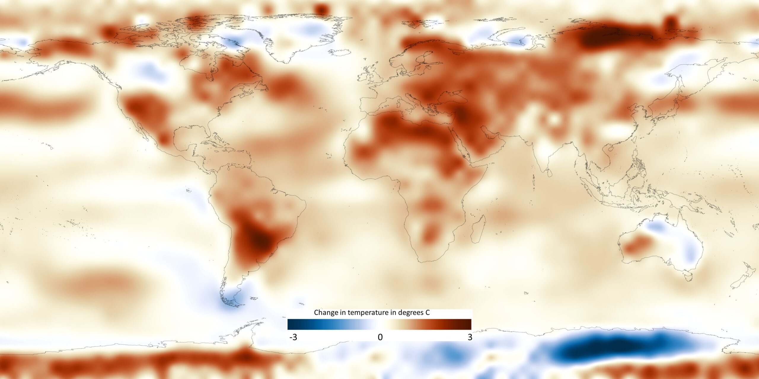
Map with Colorbar
Colorbar
Drought Monitor - Aug 13, 2024
Title: Drought Monitor - Aug 13, 2024
The USDM differentiates between short- and long-term drought. Short-term drought can have impacts on agriculture and grasslands, and the drought classification can rapidly change. Long-term drought, in contrast, has deeper impacts on hydrology and ecology and can persist even with short-term gains in precipitation. Each week, we also provide data on the Drought Severity and Coverage Index. The DSCI is a convenient, experimental method for converting categorical USDM data into a single continuous variable for each area of interest. It’s not just rain and snow. To determine drought intensity, USDM authors use a convergence of evidence approach, blending objective physical indicators with insight from local experts, condition observations and reports of drought impacts. It is this combination of the best available data, local observations and experts’ judgment that make the U.S. Drought Monitor more versatile than other drought measures. Learn more with our convergence of evidence tutorial. The USDM map provides a “snapshot” of current conditions. Authors build upon the previous week’s map, identifying areas that might have changed in response to recent weather patterns. They bring together the physical climate, weather and hydrology data and reconcile that with local expert feedback, impact reports and conditions observations. The author is also responsible for weighing different indicators based on what’s most appropriate for a particular place and time of year. In the West, for example, winter snowpack has a stronger bearing on water supplies than in the East. Dataset Sources: Drought Monitor Applicable Metadata: Category: Drought, Climate, Precipitation Related Lessons/Units: Drought: Examining the Causes and Effects of Precipitation Shortage Related Data: Link(s)- (TBD) Link to Source: Drought Monitor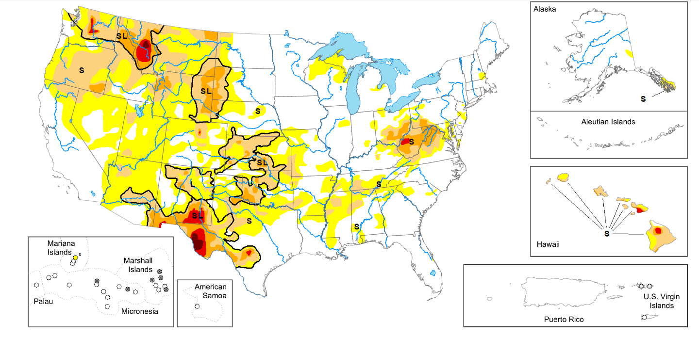
Map
Map with Legend
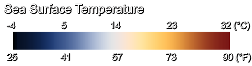
Sea Surface Temperature
Title: Sea Surface Temperature
Sea surface temperature, much like the atmosphere’s temperature, is constantly changing. Water warms up and cools down at a slower rate than air, so diurnal variations (heating during the day and cooling during the night) seen in the atmosphere are hard to observe in the ocean. The seasons, however, can be seen as the warmest water near the equator expands toward the United States during the summer months and withdraws again during the winter months. The interaction between the ocean and the atmosphere is one that scientists are constantly researching, and the temperature of the sea surface is a key factor in those interactions. Sea surface temperature anomaly is the difference between the current temperature and the long-term temperature average. Negative temperature differences indicate that the ocean is cooler than average, while positive temperature difference indicate that the ocean is warmer than average. Tracking sea surface anomalies helps scientists quickly identify areas of warming and cooling, which can affect coral reef ecosystems, hurricane development, and the development of El Nino and La Nina. The real-time sea surface temperature dataset is provided by the NOAA Visualization Lab using data from NOAA’s Coral Reef Watch. These highly detailed, daily images are possible because the data combines SST measurements from all current geostationary and polar-orbiting satellites, including U.S. satellites and those of international partners such as Japan and Europe. By collecting data from multiple satellites, cloud-free composites can be generated on a daily basis because at some point, one of the satellites will get a cloud-free observation of the ocean surface during the 24-hour period. The resolution of the data is 5 km/pixel. At this resolution, features such as the Gulf Stream along the East Coast of the United States are distinguishable. Map - 4096 x 2048 Dataset Sources: NOAA Coral Reef Watch, NOAA NESDIS Applicable Metadata: Category: Ocean, Life, Temperature, Seasons, Weather, Climate Related Lessons/Units: Tides: Understanding Impacts on Human Activity Around the Globe Related Data: Link(s)- (TBD) Link to Source: NOAA View Global Data Explorer, NOAA Science On a Sphere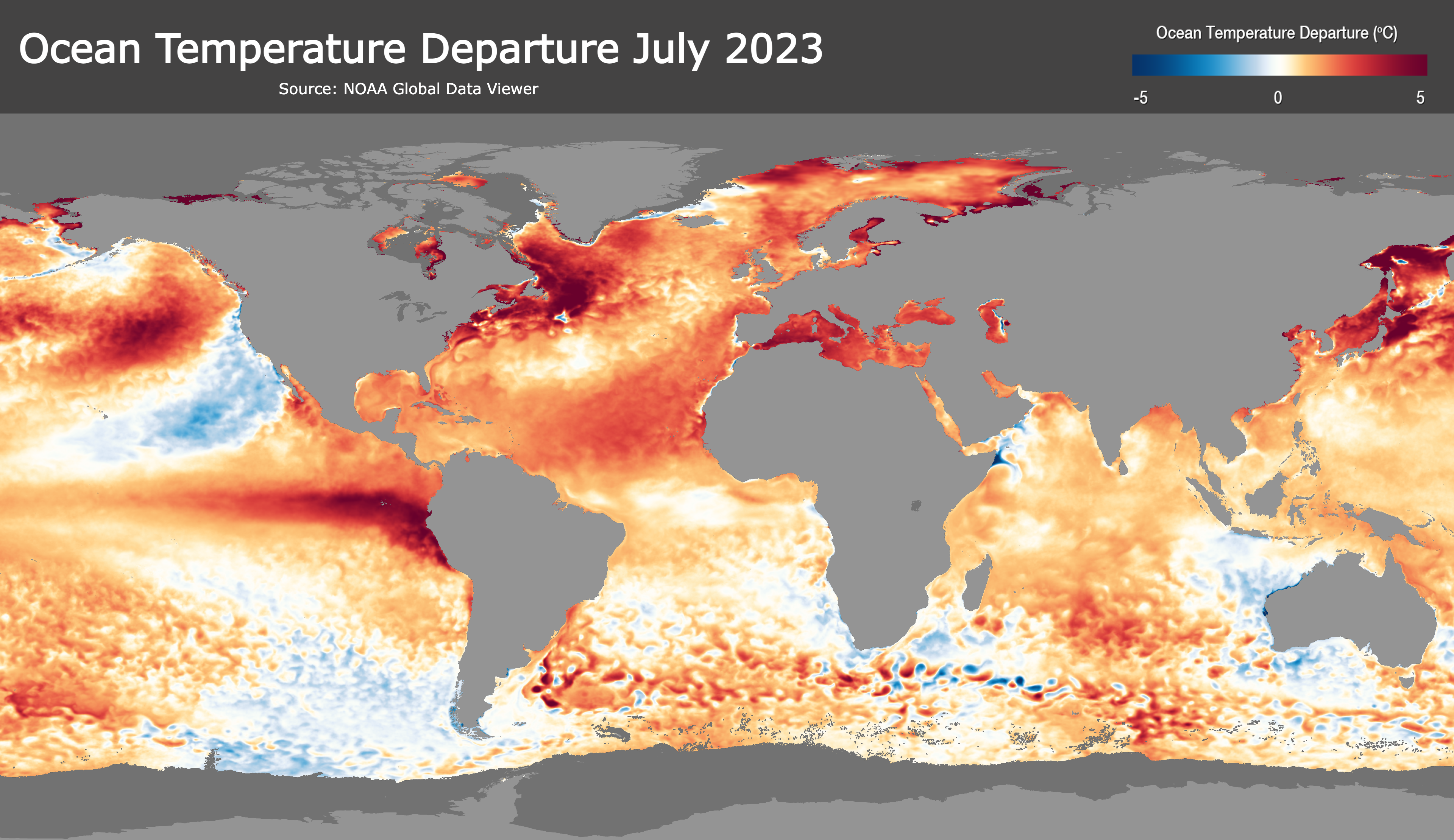
Map with Colorbar
Colorbar
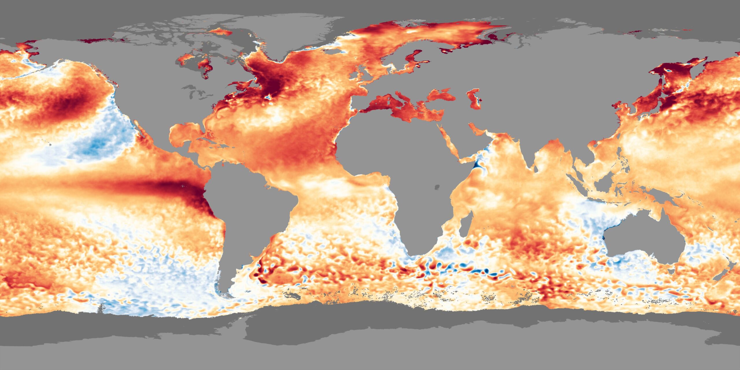
Sea Surface Temperature Anomaly - July 2023
Title: Sea Surface Temperature Anomaly - July 2023
Sea surface temperature, much like the atmosphere’s temperature, is constantly changing. Water warms up and cools down at a slower rate than air, so diurnal variations (heating during the day and cooling during the night) seen in the atmosphere are hard to observe in the ocean. The seasons, however, can be seen as the warmest water near the equator expands toward the United States during the summer months and withdraws again during the winter months. The interaction between the ocean and the atmosphere is one that scientists are constantly researching, and the temperature of the sea surface is a key factor in those interactions. Sea surface temperature anomaly is the difference between the current temperature and the long-term temperature average. Negative temperature differences indicate that the ocean is cooler than average, while positive temperature difference indicate that the ocean is warmer than average. Tracking sea surface anomalies helps scientists quickly identify areas of warming and cooling, which can affect coral reef ecosystems, hurricane development, and the development of El Nino and La Nina. The real-time sea surface temperature dataset is provided by the NOAA Visualization Lab using data from NOAA’s Coral Reef Watch, meaning it is the same data source as other real-time ocean temperature products, such as SST, Coral Degree Heating Weeks and Coral HotSpots. The data combines measurements from all current geostationary and polar-orbiting satellites, including U.S. satellites and those of international partners such as Japan and Europe. Those measurements are then subtracted from the long-term mean SST for that day to create the anomaly. Since the data is at 5 km/pixel resolution, not only can you see large-scale patters such as El Nino-La Nina, but also many smaller features, such as hurricane wakes. The entire archive of this imagery, starting in 1981, is available from NOAA View. Map - 4096 x 2048 Dataset Sources: NOAA Coral Reef Watch Applicable Metadata: Category:Temperature, Oceans, Water, Climate Change, Climate, Weather, El Nino/La Nina Related Lessons/Units: Biodiversity: The Impact of Population Density and Temperature Change on Bird Populations Related Data: Link(s)- (TBD) Link to Source: NOAA Science On a Sphere, NOAA View Global Data Explorer
Map with Colorbar and Title
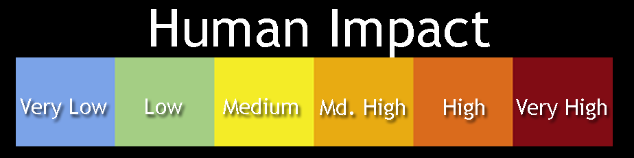
Human Influence on Marine Ecosystems
Title: Human Influence on Marine Ecosystems
The ocean has an impact on the lives of everyone on Earth, even those who don't live on the coasts. It has been estimated that one in every six jobs in the United States is marine-related and that 50% of all species on Earth are supported by the ocean. Because of this, it is important to protect and preserve the oceans. Humans however have been shown to have a negative impact on the oceans. A report issued in February 2008 found that 40% of the world's oceans are heavily impacted by human activities, such as overfishing and pollution. In all 17 different human activities were examined in the report, including fertilizer run-off, commercial shipping, and indirect activities such as changes in sea surface temperature, UV radiation, and ocean acidification. This dataset is a map that was put together from the data compiled from the report, A Global Map of Human Impact on Marine Ecosystems, which was published in Science Magazine. In addition to finding that 40% of the world's oceans are heavily impacted by human activities, researchers also concluded that no area is unaffected by human influence. However, there are large areas that have relatively low human impact, especially near the poles. The areas where humans have had the worst impact include the East Coast of North America, North Sea, South and East China Seas, Caribbean Sea, Mediterranean Sea, Red Sea, Persian Gulf, Bering Sea and the western Pacific Ocean. Areas that are shaded red have a high human impact and blue areas have a very low human impact. The study also examined 20 marine ecosystems to determine the impact of the human influences. The ecosystems that are most threatened are coral reefs, seagrass beds, and mangroves Map - 4096 x 2048 Dataset Sources: NOAA NESDIS Applicable Metadata: Category: Ocean, Life, Human Impact Related Lessons/Units: Mapping Human Impacts: Human Activity and the Environment Related Data: Link(s)- (TBD) Link to Source: NOAA Science On a Sphere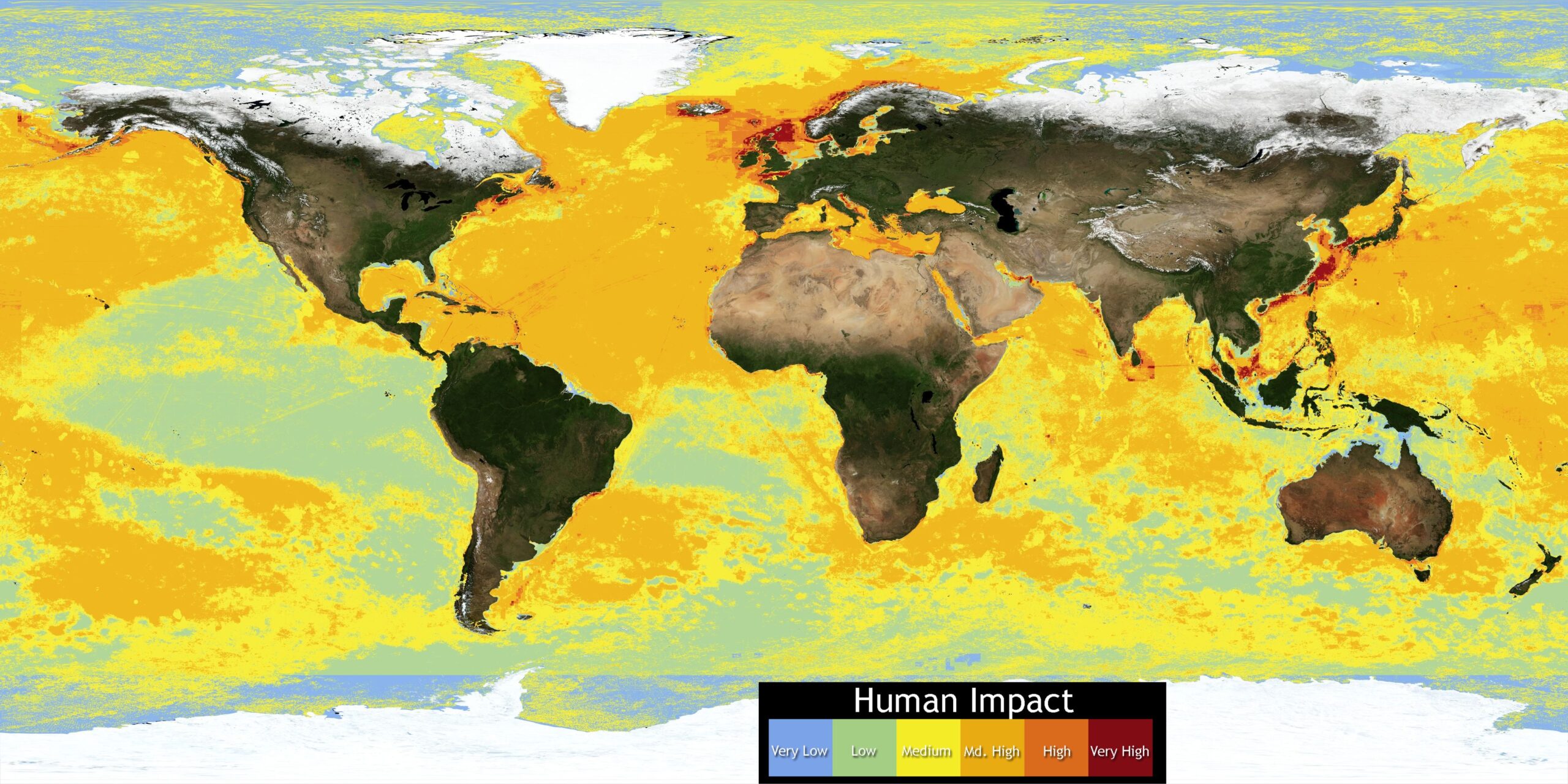
Map with Colorbar
Colorbar
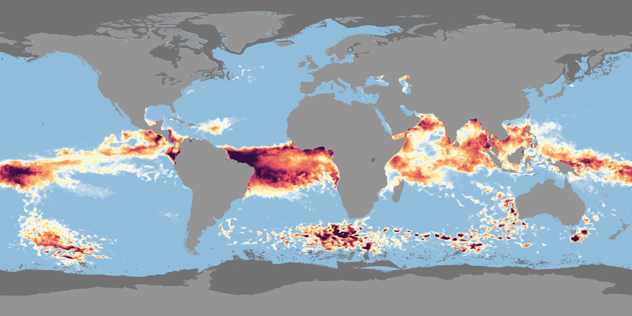
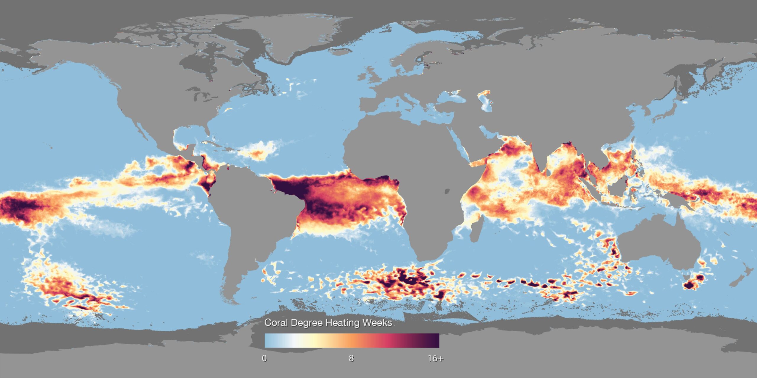
Coral Bleaching - Degree Heating Weeks
Title: Coral Bleaching - Degree Heating Weeks
Earth’s outer surface is like a jigsaw puzzle, made up of about 20 tectonic plates that fit together and meet at plate boundaries. These boundaries are crucial because they are often sites of earthquakes and volcanoes. When tectonic plates grind past each other, the resulting friction can cause earthquakes. Volcanoes frequently form near plate boundaries due to magma rising from deep within the Earth. There are three main types of plate boundaries: A single tectonic plate can interact with multiple other plates, leading to various boundary types. For instance, the Pacific Plate includes convergent, divergent, and transform boundaries. Files Map - 4096 x 2048 Dataset Sources: NOAA Coral Reef Watch, NOAA NESDIS Applicable Metadata: Category: Ocean, Life, Temperature Related Lessons/Units: Mapping Human Impacts: Human Activity and the Environment Related Data: Link(s)- (TBD) Link to Source: NOAA View Global Data Explorer, NOAA Science On a Sphere
Map with Colorbar
Colorbar
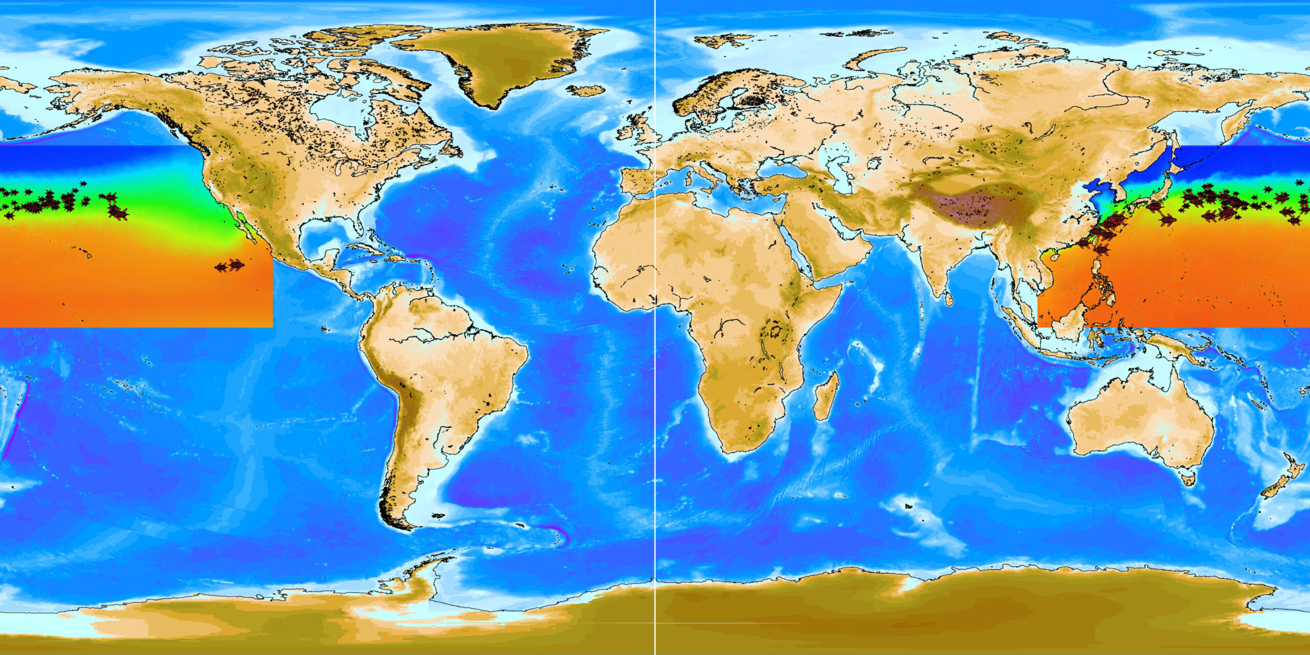
Loggerhead Sea Turtle Tracks
Title: Loggerhead Sea Turtle Tracks
Using satellite transmitting tags on wildlife allows scientists to monitor the behaviors of the wildlife in their natural habitats. This dataset contains the tracks of juvenile loggerhead sea turtles that were tagged and monitored. Some of the turtles were caught on commercial fishing vessels north of Hawaii and the other turtles were raised in the hatchery at the Port of Nagoya Aquarium in Japan. After being tagged the turtles were released at various at-sea locations. The data used in this dataset is from 1997 through 2006. The animation represents a daily climatology showing the turtle daily movement, independent of the year. The background is a daily climatology of satellite remotely-sensed sea surface temperature. The size of the turtle graphic is proportional to the turtle length. Research from the National Marine Fisheries Service has shown that these turtles use surface chlorophyll and temperature gradients to determine their migration habits. In this dataset, the turtles generally remain in a narrow temperature band and move north and south seasonally with that temperature band. Also, the eastern region of the Kuroshio Extension Current near Japan represents an important mid-oceanic foraging hotspot, where many of the turtles in the dataset can be viewed. Dataset Sources: Pacific Islands Fisheries Science Center Applicable Metadata: Category: Oceans, Life, Temperature Related Lessons/Units: Mapping Human Impacts: Human Activity and the Environment Related Data: Link(s)- (TBD) Link to Source: NOAA Science On a Sphere
Fisheries Species Richness
Title: Fisheries Species Richness
Species richness is a count of the number of different species in an ecological community, landscape or region. Species richness is one of several measurements used by scientists to help determine how biologically rich and diverse a given area is. This map shows the predicted global distribution of 1066 commercially harvested marine fish and invertebrates. Areas on the map with brighter colors (orange/yellow) highlight areas with greater number of different species (higher species richness), while cooler colors (purple) areas with lower number of species (lower species richness). The map shows the highest number of different species is concentrated along the coasts. These coastal areas are also where we find our largest marine ecosystems, such as coral reefs, mangroves and marshes, which provide food and shelter for economically, culturally, and ecologically important marine species. This stresses the importance of protecting critical habitat along our coasts for marine life and fisheries. A noticeably rich area on the map is the large area between Australia and Vietnam, which encompasses the Coral Triangle. The Coral Triangle is one of the world's most important marine hotspots for biodiversity and one of the most productive fishing areas in the world. Many nations in this region depend heavily on fisheries for their livelihood and economy, with fisheries accounting for over 90% of protein source in some countries. Map - 4096 x 2048 Dataset Sources: Changing Ocean Research Unit, University of British Columbia Applicable Metadata: Category: Ocean, Life, Human Impact Related Lessons/Units: Mapping Human Impacts: Human Activity and the Environment Related Data: Link(s)- (TBD) Link to Source: NOAA Science On a Sphere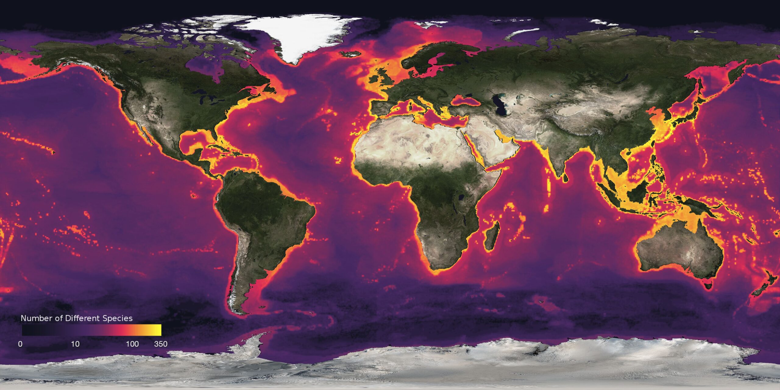
Map with Colorbar
Colorbar
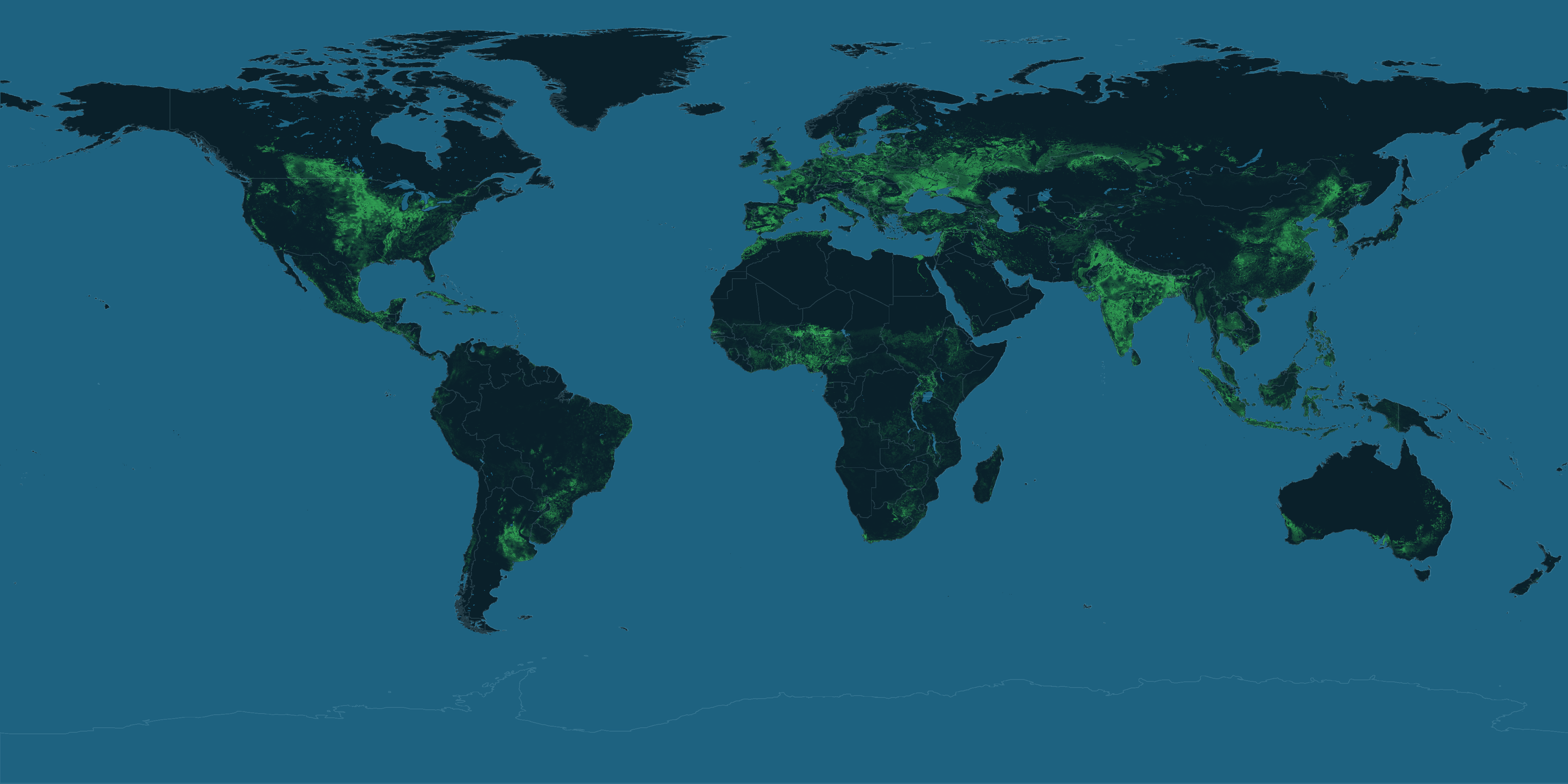
Agriculture: Cropland Intensity
Title: Agriculture: Cropland Intensity
These visualizations, created by the University of Minnesota’s Institute on the Environment, show the global land use intensity for pastureland and cropland.Cropland is land devoted to growing plants for humans use for food, material, or fuel. Pastureland is land used for raising and grazing animals. Altogether, cropland covers about 16 million square kilometers, an area of land approximately the size of South America. Global pastureland occupies more than 30 million square kilometers, about the area of Africa. Cumulatively, agricultural land covers about 40% of the Earth’s land surface, and the vast majority of its arable land. Creating additional farmlands would require the destruction of other ecosystems, such as the tropical rainforests. Map - 4096x2048 Dataset Sources: University of Minnesota Institute on the Environment Applicable Metadata: Category: Agriculture, Water, Food, Human Impact Related Lessons/Units: (Doug’s) Related Data: Link(s)- (TBD) Link to Source: NOAA Science On a Sphere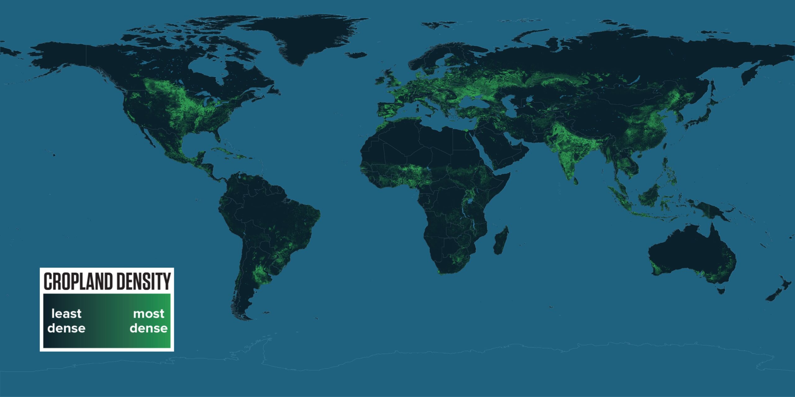
Map with Legend
Legend
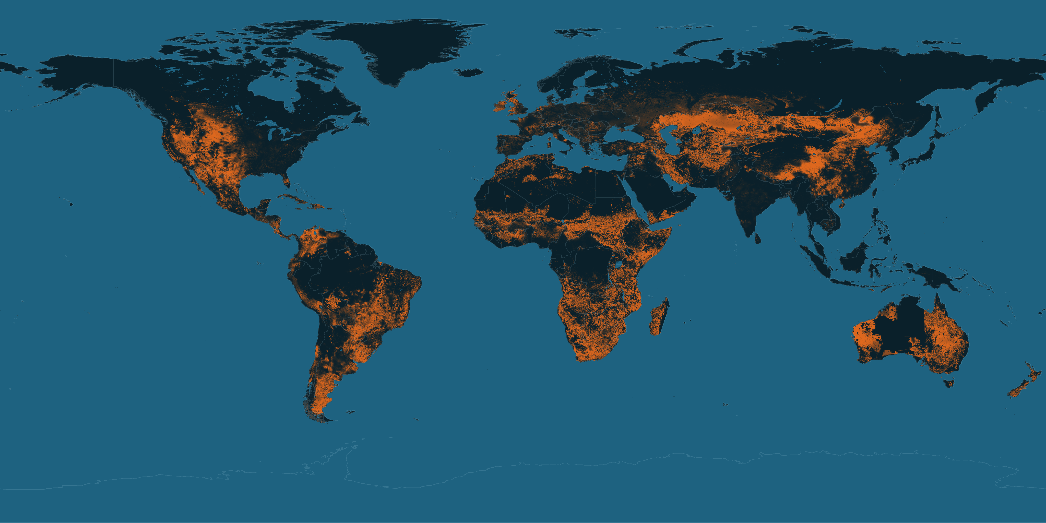
Agriculture: Pastureland Intensity
Title: Agriculture: Pastureland Intensity
These visualizations, created by the University of Minnesota’s Institute on the Environment, show the global land use intensity for pastureland and cropland.Cropland is land devoted to growing plants for humans use for food, material, or fuel. Pastureland is land used for raising and grazing animals. Altogether, cropland covers about 16 million square kilometers, an area of land approximately the size of South America. Global pastureland occupies more than 30 million square kilometers, about the area of Africa. Cumulatively, agricultural land covers about 40% of the Earth’s land surface, and the vast majority of its arable land. Creating additional farmlands would require the destruction of other ecosystems, such as the tropical rainforests. Dataset Sources: University of Minnesota Institute on the Environment Applicable Metadata: Category: Agriculture, Water, Food, Human Impact, Animals Related Lessons/Units: (Doug’s) Related Data: Link(s)- (TBD) Link to Source: NOAA Science On a Sphere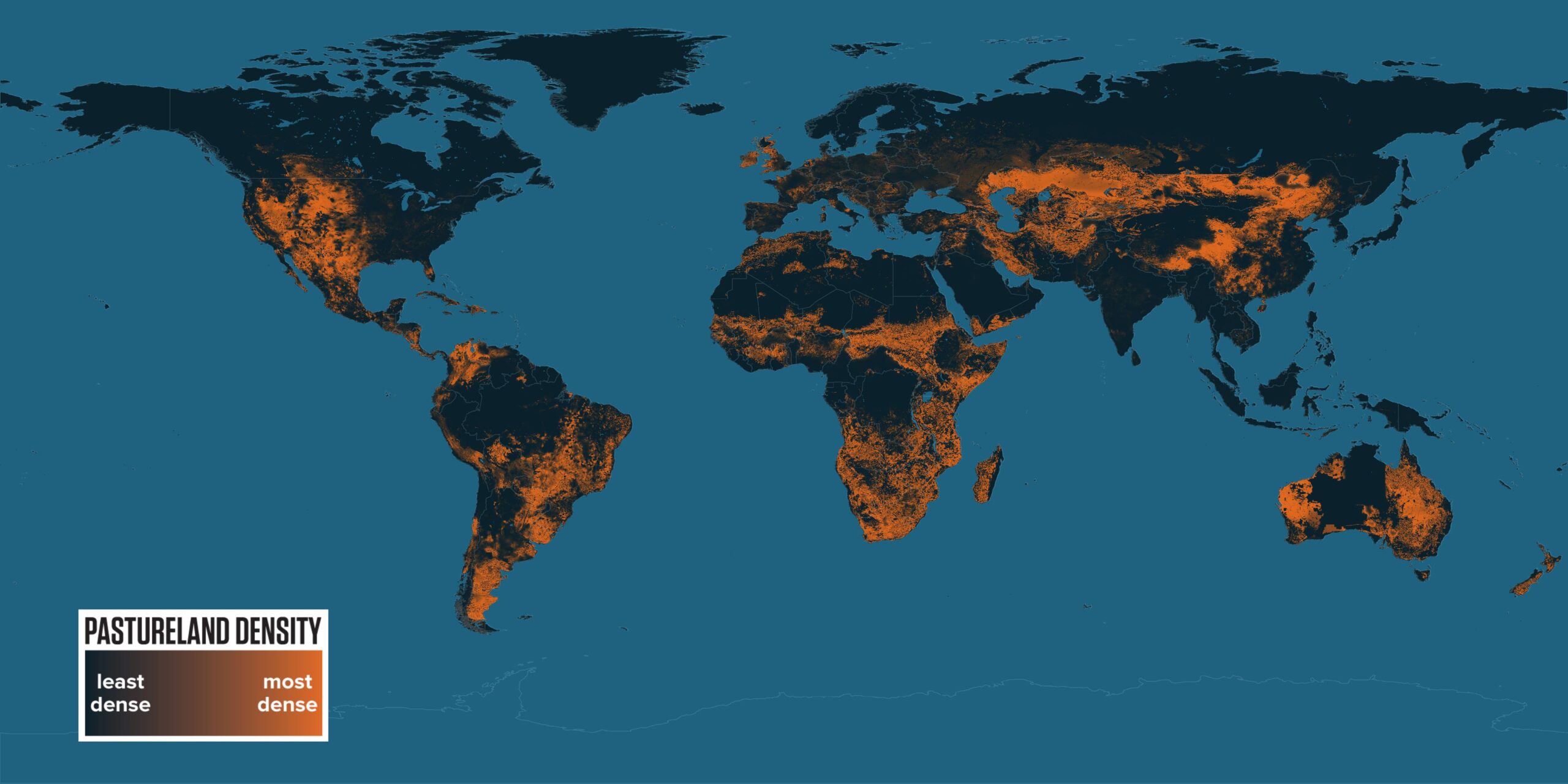
Map
Map with Legend
Legend
Agriculture: Cropland Production Gap
Title: Agriculture: Cropland Production Gap
The Agriculture datasets on SOS show current and potential yields for the three top global crops, corn, wheat and rice, measured in tons per hectare. Potential yield for a given area is determined by using the productivity of another region with analogous environmental conditions and optimized water and nutrient input as a benchmark. In both maps, darker areas show smaller yields, while bright pink areas indicate higher yields. The production gap map highlights the difference between current and potential yields. While some regions may have a very high potential yield, it may already be nearly equaled by their current yields. (See the American Midwest for areas that are producing very near to their full potential.) Regions with greater room for improvement, however, stand out in bright yellow on the yield gap map. Bright spots in Asia, West Africa, Eastern Europe and Central America, for instance, indicate locations where significantly more food can be produced. Map - 4096 x 2048 Dataset Sources: University of Minnesota Institute on the Environment Applicable Metadata: Category: Agriculture, Food, Global Hunger, Cropland Related Lessons/Units: Mapping Human Impacts: Human Activity and the Environment Related Data: Link(s)- (TBD) Link to Source: NOAA Science On a Sphere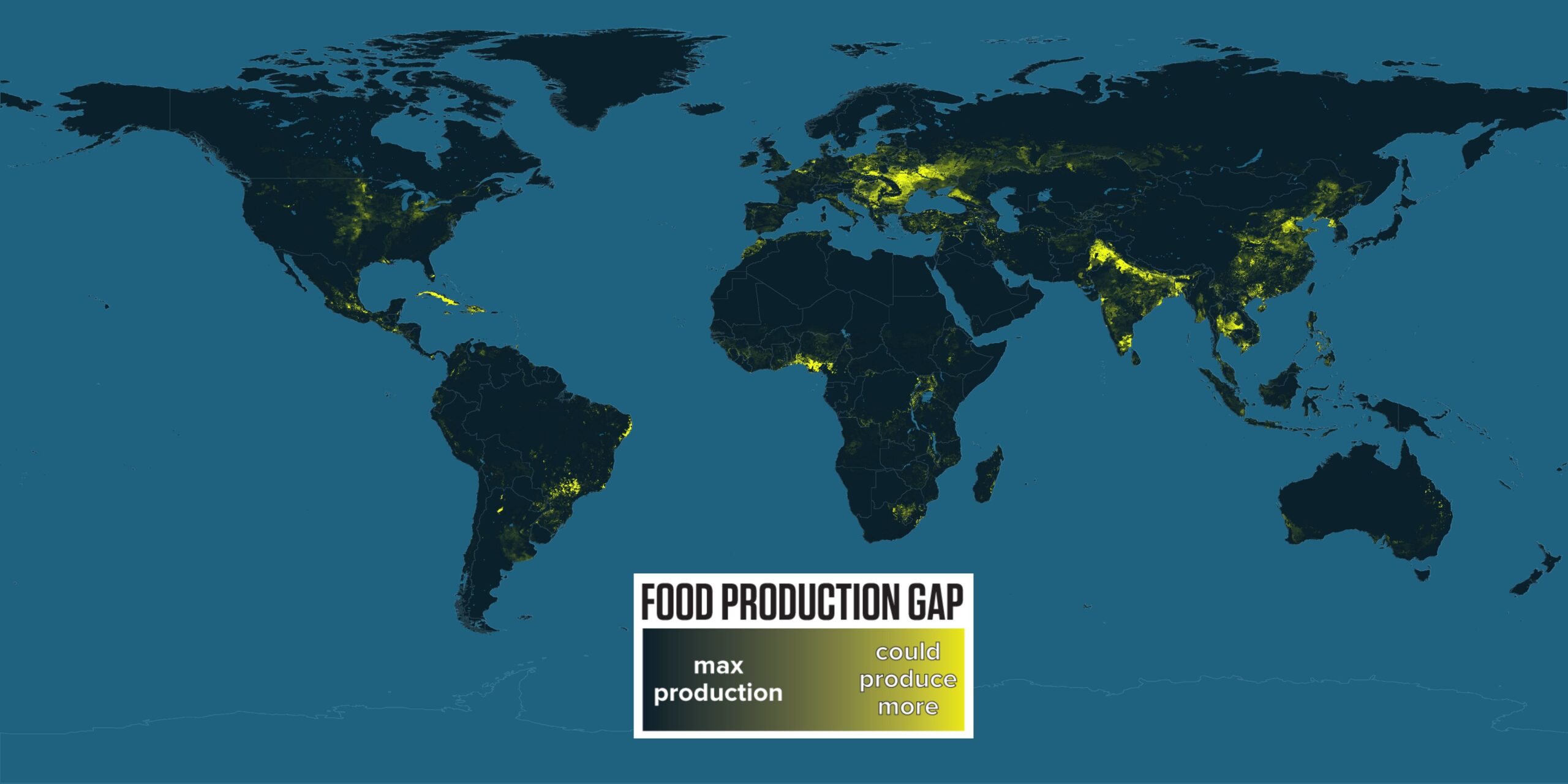
Map with Colorbar
Colorbar
Forest Change - Gain and Loss
Title: Forest Change - Gain and Loss
This dataset shows annual tree cover extent, gain, and loss from the year 2001 to 2014, at 30 meter resolution, as colored layers that can be seen together or one at a time as individual layers that can be toggled on and off. Green is used to represent tree cover in 2000, red shows tree cover loss between 2001-2014, blue shows tree cover gain between 2001-2014, and purple is gain and loss together due to replanting after loss has occurred. “Tree cover” is defined as all vegetation greater than 5 meters in height, and may take the form of natural forests or plantations across a range of canopy densities. “Loss” indicates the removal or mortality of tree cover and can be due to a variety of factors, including mechanical harvesting, fire, disease, or storm damage. As such, “loss” does not directly equate to deforestation. The dataset is a collaboration between by Global Forest Watch partners at GLAD (Global Land Analysis & Discovery) lab at the University of Maryland, Google, USGS and NASA. The data were generated using Landsat imagery and algorithms to measure where tree cover patterns extend, or are lost, each year. When the algorithm sees the pattern of tree cover is missing or existing after one year, it places a pixel where this occurred. The tree cover extent data is used to measure against the loss or gain, thus giving us a sense of where the trees were to begin with or where they have been planted. Trees grow much faster in warmer, tropical regions than in colder, boreal regions. That is why there appears to be stronger overlap with loss and gain data (purple) in some parts of the world; trees are cut down, but they might grow back very quickly. This is also true of production forests and plantations; overlap in areas like Scandinavia and the southeast USA look particularly purple because these areas are logged then replanted with more timber trees, or in Indonesia areas are cleared then often replanted with oil palm plantations. Map - 4096 x 2048 Dataset Sources: Global Forest Watch Applicable Metadata: Category: Forests, Biosphere, Ecosystem, Human Impact Related Lessons/Units: Mapping Human Impacts: Human Activity and the Environment Related Data: Link(s)- (TBD) Link to Source: NOAA Science On a Sphere, Global Forest Watch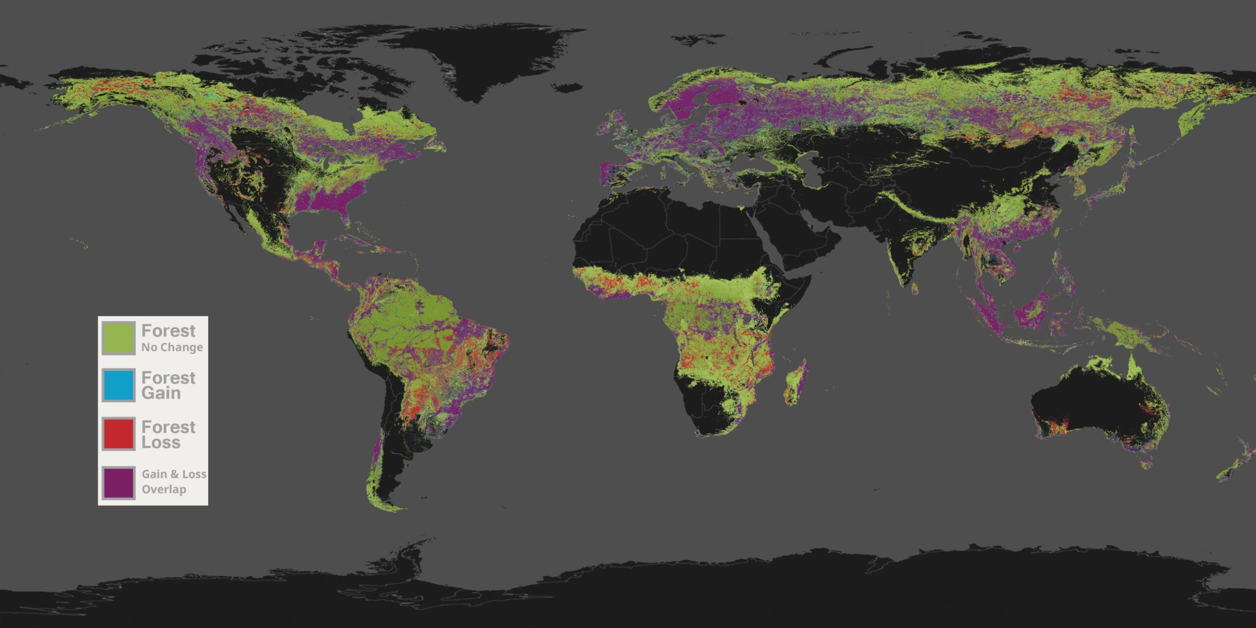
Map with Colorbar
Colorbar
Bats - Projected Spread of White Nose Syndrome
Title: Bats - Projected Spread of White Nose Syndrome
Sean Maher has updated our model for the spread of White-nose Syndrome in the United States. The revised model was fit to data on the timing of all known county-level infections as of September 2014. There are two main differences. First, with two more years of spread, there are more counties now known to be infected. Second, Woodward County, Oklahoma, which was believed to have been infected at the time of the original study is now known to have been a false positive. The revised model projects a somewhat faster speed of spread, predicting that the pathogen will reach all counties by 2035. The predicted overall route of spread is unchanged, as this is reflects the geographic patterns of cave-bearing geology and climate. Dataset Sources: Drake Lab Applicable Metadata: Category: Animals, Diversity, Bats, National Map Related Lessons/Units: Ecosystem Dynamics: Bat Populations in a Changing Environment Related Data: Link(s)- (TBD) Link to Source: Drake Lab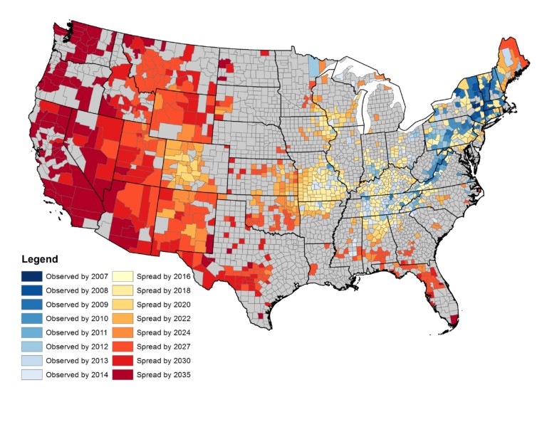
Map
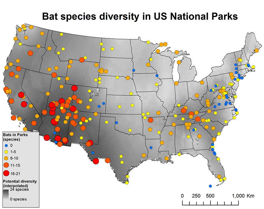
Bat Diversity in U.S. National Parks
Title: Bat Diversity in U.S. National Parks
Dataset Sources: Global Forest Watch Applicable Metadata: Category: Animals, Diversity, Bats, National Map, Disease Related Lessons/Units: Ecosystem Dynamics: Bat Populations in a Changing Environment Related Data: Link(s)- (TBD) Link to Source: National Parks Service
Map
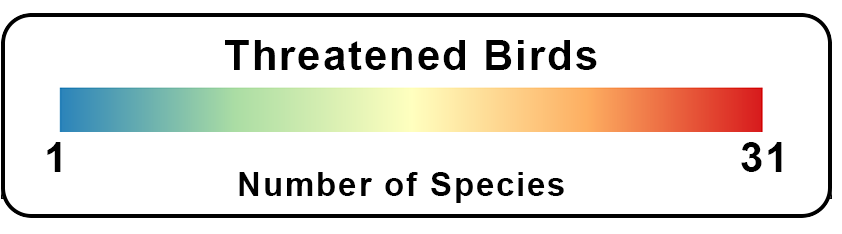
Species Richness - Birds Threatened
Title: Species Richness - Birds Threatened
Understanding the biodiversity of our planet is critical for developing conservation strategies. This series of datasets shows the biodiversity of birds, mammals, and amphibians. Said simply, these maps show how many kinds of birds or mammals or amphibians live in each area around the world. These maps look at just the animals on land and don’t include any marine animals. Also included are corresponding maps of where the threatened species live, the ones at greatest risk of extinction. Knowing where these threatened species live can help direct conservation efforts to ensure that the places with the most vulnerable species are being protected. The species data for this dataset comes from BirdLife International and includes the 1,308 species that are classified as threatened with a high risk of extinction, which is about 14% of known species of birds. The species at risk concentrate in those areas of the world where high biodiversity and human impacts collide, such as the Brazil Atlantic Forest, Andes, southeast Asia, and some oceanic islands. Dataset Sources: Bird Life, Biodiversity Mapping Applicable Metadata: Category: Animals, Biodiversity, Birds, Endangered Species, Human Impact Related Lessons/Units: Biodiversity: The Impact of Population Density and Temperature Change on Bird Populations Related Data: Link(s)- (TBD) Link to Source: NOAA Science On a Sphere, Biodiversity Mapping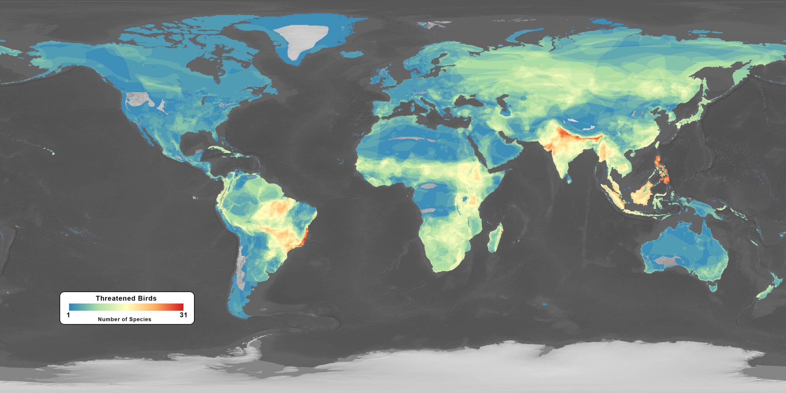
Map - 4096x2048
Legend
Map with Legend
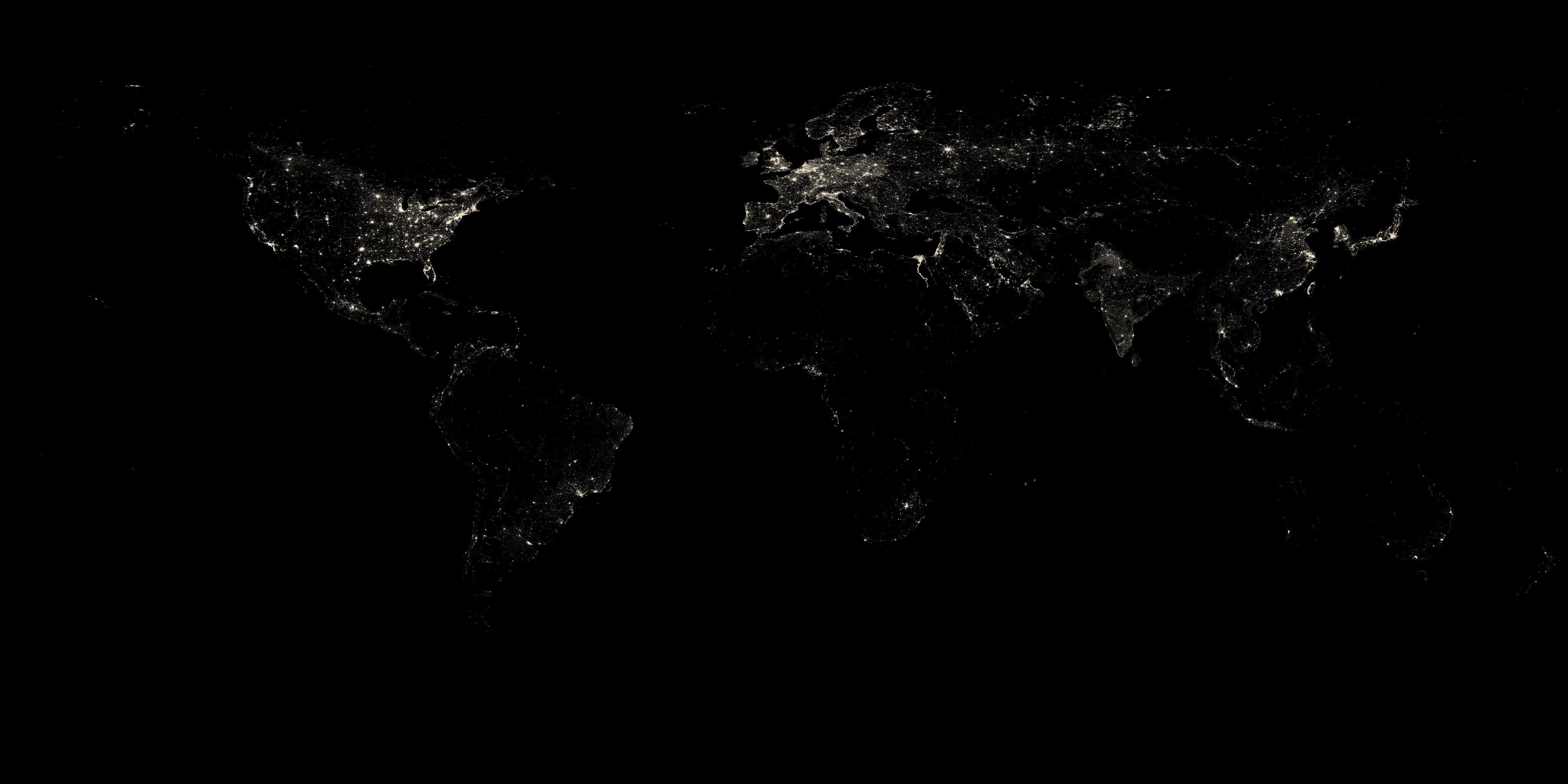
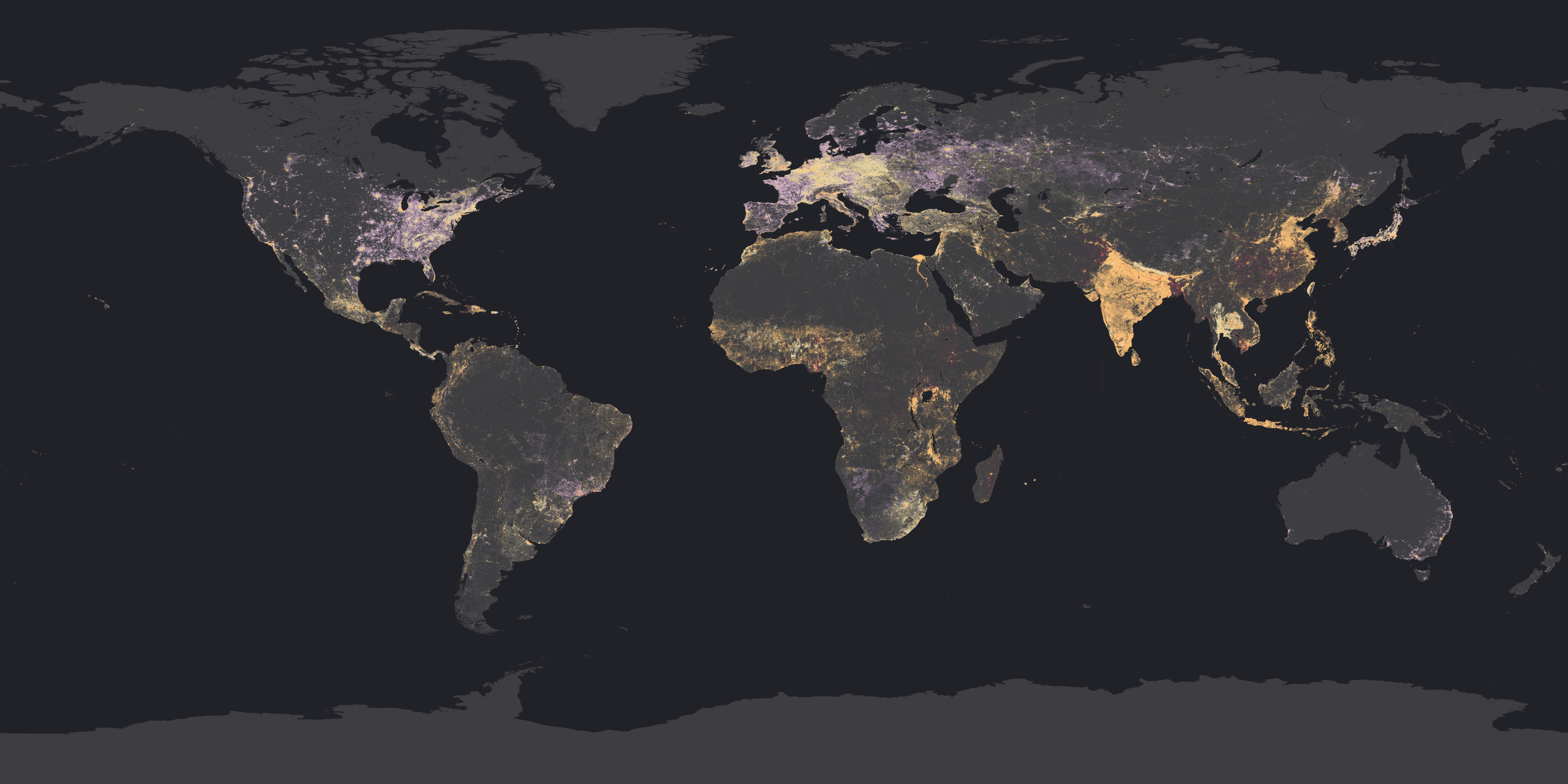
Nighttime Lights - 2010
Title: Nighttime Lights - 2010
Earth at Night has been an SOS-user favorite dataset for many years. Black Marble 2012 is the newest version of the spectacular view of our planet from near-Earth orbit at night, which is the result of a partnership between NOAA, NASA, and the Department of Defense. Lights sparkle across the dark planet, tracing roads and political boundaries, revealing areas where use of electric power is expanding and those where storms have knocked out power, and highlighting the locations of brightly-lit fishing fleets. It is possible to detect clouds illuminated by moonlight, lights from cities and towns, industrial sites, gas flares, fires, lightning, and aurora. This remarkable view of our planet comes from an instrument on the NOAA-NASA Suomi National Polar-orbiting Partnership (NPP) satellite, and is the result of careful work by scientists and visual experts at the two agencies and academic collaborators. Map - 4096 x 2048 Dataset Sources: NOAA NCEI Applicable Metadata: Category: Lights, Population, Human Impact, Energy, People Related Lessons/Units: Earth's Changing Atmosphere: Human Impacts and Climate Change Related Data: Link(s)- (TBD) Link to Source: NOAA Science On a Sphere, NOAA View Global Data Explorer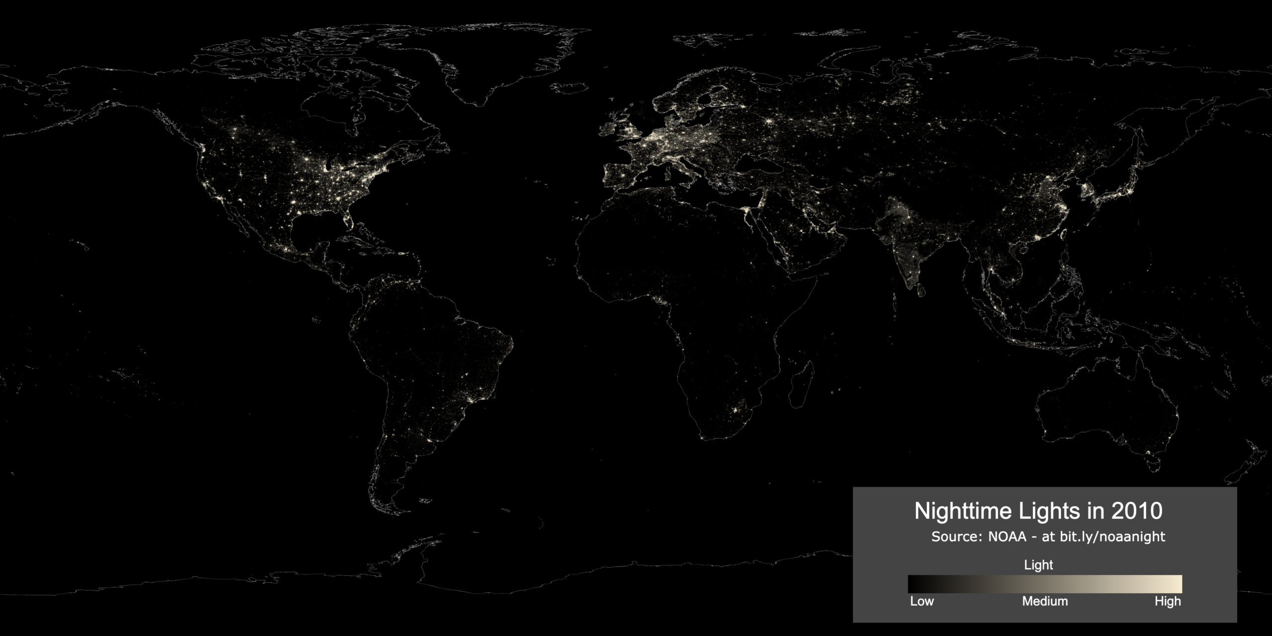
Map with Colorbar and Title
Freshwater Withdrawals: U.S. - 2010
Title: Freshwater Withdrawals: U.S. - 2010
The water in the Nation's rivers, lakes, reservoirs, and underground aquifers are vitally important to our everyday life. These water bodies supply the water to serve the needs of every human and for the world's ecological systems, too. Here in the United States, every 5 years the U.S. Geological Survey (USGS) compiles county, state, and National water withdrawal and use data for a number of water-use categories. Water use in the United States in 2015 was estimated to be about 322 billion gallons per day (Bgal/d), which was 9 percent less than in 2010. The 2015 estimates put total withdrawals at the lowest level since before 1970, following the same overall trend of decreasing total withdrawals observed from 2005 to 2010. In terms of physical indicators, the USDM relies on several numeric inputs. Short-term drought measures focus on precipitation on the scale of 1-3 months. Long-term blends, in contrast, focus on 6-60 months. But authors rely on several climate, weather and hydrology inputs across different time spans, shown broadly in the graphic below. Dataset Sources: USGS Applicable Metadata: Category: Freshwater, Population, Agriculture Related Lessons/Units: Drought: Examining the Causes and Effects of Precipitation Shortage Related Data: Link(s)- (TBD) Link to Source: USGS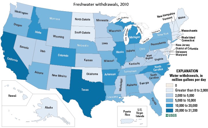
Map
Dams and Reservoirs - 1800-2010
Title: Dams and Reservoirs - 1800-2010
Humans have manipulated rivers for thousands of years, but over the last 200 years dams on rivers have become rampant. Reservoirs and dams are constructed for water storage, to reduce the risk of river flooding, and for the generation of power. They are one of the major footprints of humans on Earth and change the world's hydrological cycle. This dataset illustrates the construction of dams worldwide from 1800 to the present. We display all dams listed in the Global Reservoir and Dam Database (GRanD). It includes 6,862 records of reservoirs and their associated dams. All dams that have a reservoir with a storage capacity of more than 0.1 cubic kilometers are included, and many smaller dams were added where data were available. The total amount of water stored behind these dams sums to 6.2 km3. The yellow dots represent the dams already in place. The dams and reservoirs do not only store water, they also trap the incoming sediment that the river transports. Consequently, much less sand and clay travels to the coast, where it would normally be depositing in the delta region. The reduced sediment load of major rivers has influenced the vulnerability of many deltas worldwide. Dataset Sources: Community Surface Dynamics Modeling System (CSDMS) Applicable Metadata: Category: Rivers, Freshwater, People, Human Impact Related Lessons/Units: Human Impacts on the Environment: Water Management in the Colorado River Basin Related Data: Link(s)- (TBD) Link to Source: NOAA Science On a Sphere
Map
Population Density - U.S.
Title: Population Density - U.S.
This dataset shows annual tree cover extent, gain, and loss from the year 2001 to 2014, at 30 meter resolution, as colored layers that can be seen together or one at a time as individual layers that can be toggled on and off. Green is used to represent tree cover in 2000, red shows tree cover loss between 2001-2014, blue shows tree cover gain between 2001-2014, and purple is gain and loss together due to replanting after loss has occurred. “Tree cover” is defined as all vegetation greater than 5 meters in height, and may take the form of natural forests or plantations across a range of canopy densities. “Loss” indicates the removal or mortality of tree cover and can be due to a variety of factors, including mechanical harvesting, fire, disease, or storm damage. As such, “loss” does not directly equate to deforestation. The dataset is a collaboration between by Global Forest Watch partners at GLAD (Global Land Analysis & Discovery) lab at the University of Maryland, Google, USGS and NASA. The data were generated using Landsat imagery and algorithms to measure where tree cover patterns extend, or are lost, each year. When the algorithm sees the pattern of tree cover is missing or existing after one year, it places a pixel where this occurred. The tree cover extent data is used to measure against the loss or gain, thus giving us a sense of where the trees were to begin with or where they have been planted. Trees grow much faster in warmer, tropical regions than in colder, boreal regions. That is why there appears to be stronger overlap with loss and gain data (purple) in some parts of the world; trees are cut down, but they might grow back very quickly. This is also true of production forests and plantations; overlap in areas like Scandinavia and the southeast USA look particularly purple because these areas are logged then replanted with more timber trees, or in Indonesia areas are cleared then often replanted with oil palm plantations. Dataset Sources: Mapchart.net Applicable Metadata: Category: Human, People, Density, National Map Related Lessons/Units: Ecosystem Dynamics: Bat Populations in a Changing Environment Related Data: Link(s)- (TBD) Link to Source: Mapchart.net
Map
Population Density 2016
Title: Population Density 2016
This layer is a global estimate of human population density for 2016. The advantage population density affords over raw population counts is the ability to compare levels of persons per square kilometer anywhere in the world. Esri calculated density by converting the the World Population Estimate 2016 layer to polygons, then added an attribute for geodesic area, which allowed density to be derived, and that was converted back to raster. Map - 4096 x 2048 Dataset Sources: Arc GIS Applicable Metadata: Category: Population, People, Human Impact Related Lessons/Units: Biodiversity: The Impact of Population Density and Temperature Change on Bird Populations; Plate Tectonics: Plate Boundaries, Earthquakes, and Volcanoes Related Data: Link(s)- (TBD) Link to Source: NOAA Science On a Sphere 
Map with Colorbar
Colorbar Transparent
Colorbar
Population by Country
Title: Population by Country
This map shows the population of humans per country. The data is from the Nelson Institute Center for Sustainability and the Global Environment at the University of Wisconsin in Madison, which created an online database of maps called the Atlas of the Biosphere. The Atlas's purpose is to provide an easily accessible collection of maps from several different sources. This particular set of data was taken from a census performed by Newsweek magazine in 2000. Dataset Sources: Nelson Institute for Environmental Studies Applicable Metadata: Category: Population, Human Impact Related Lessons/Units: Mapping Human Impacts: Human Activity and the Environment Related Data: Link(s)- (TBD) Link to Source: NOAA Science On a Sphere
Shipping Routes
Title: Shipping Routes
There were more than 30,000 merchant ships greater than 1000 gross tonnage at sea in 2005. The World Meteorological Organization has a Voluntary Observing Ships Scheme that equips ships with weather instruments in order to provide observations for weather models and forecasters. In addition to observing the weather, the location of the ships is also recorded through GPS. From October 2004 through October of 2005 1,189,127 mobile ship data points were collected from 3,374 commercial and research vessels, which is about 11% of all ships at sea in 2005. By connecting the data points for each vessel, shipping routes over the course of one year were plotted. The National Center for Ecological Analysis and Synthesis compiled this data to include in their Global Map of Human Impacts to Marine Ecosystems. As seen in this dataset, there are several very popular shipping routes around the world. The density of ship tracks in any location ranges from 0 to 1,158 on this map, showing relative density (in color) against a black background with scale of 1 km. Some of the most populated shipping routes cross through the Panama Canal, the Suez Canal, the Strait of Malacca , and the Strait of Gibraltar. Because only 11% of ships are represented in this dataset, the density of ship traffic is not fully portrayed and is biased to the types of ships that volunteered for the program. The map creators suggest that the high traffic locations may be strongly underestimated. In spite of this, there are enough data points to highlight some of the busiest shipping routes. There is also a version of this dataset with the major canals and straits labeled. Dataset Sources: NOAA Science On a Sphere, National Center for Ecological Analysis and Synthesis Applicable Metadata: Category: Ocean, Human Impact, Life Related Lessons/Units: Tides: Understanding Impacts on Human Activity Around the Globe Related Data: Link(s)- (TBD) Link to Source: NOAA Science On a Sphere Dataset Catalog 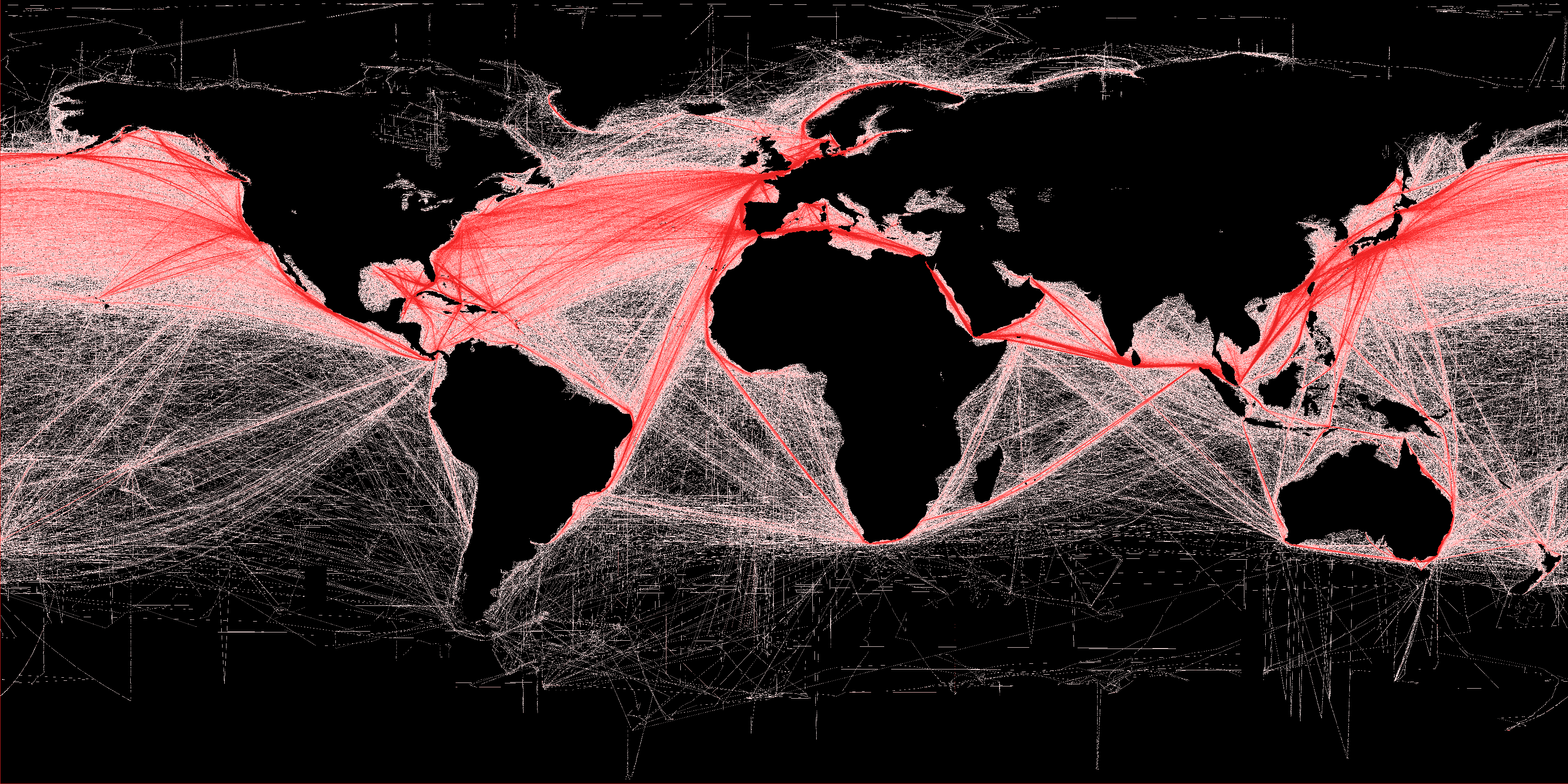
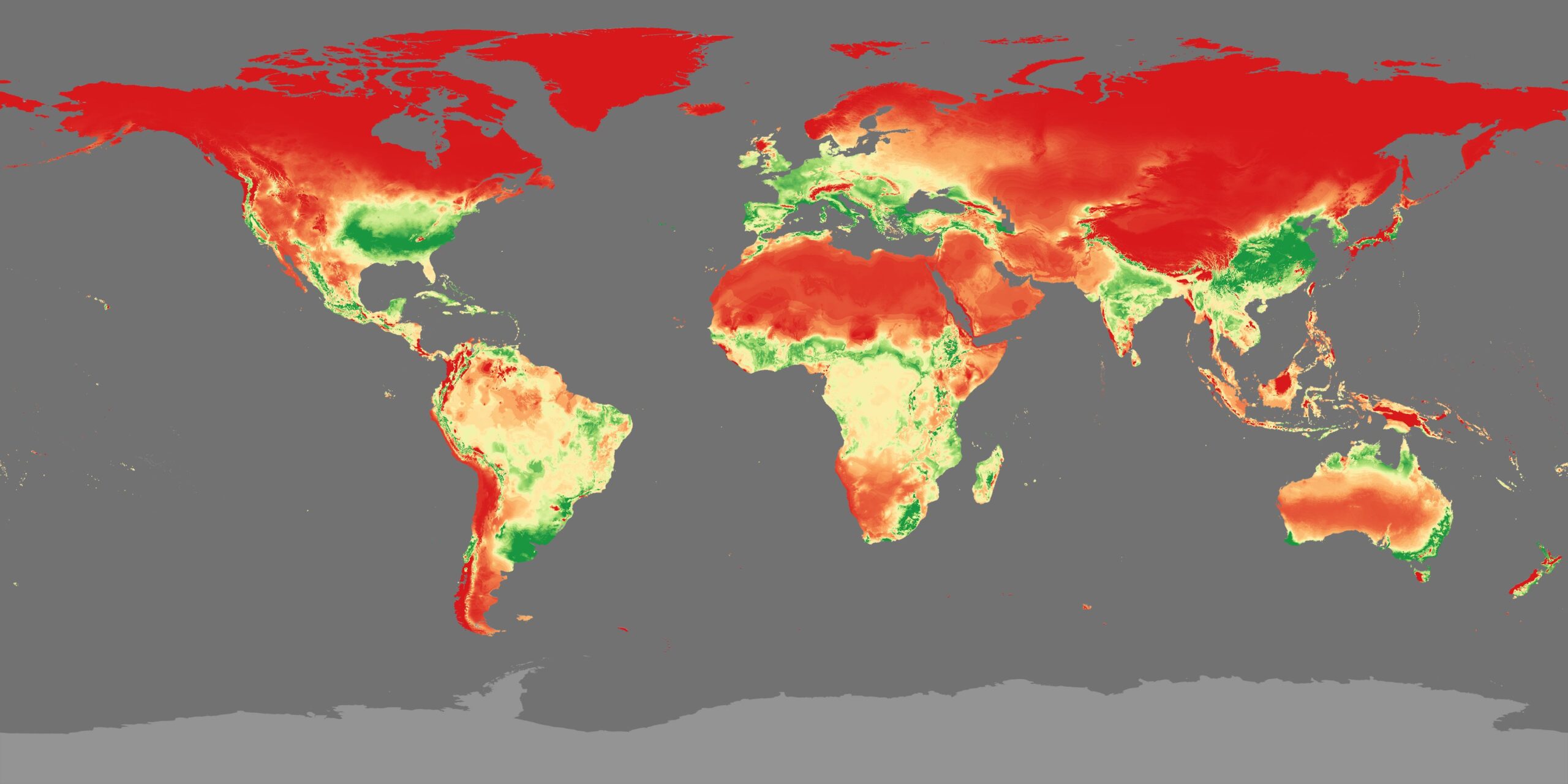
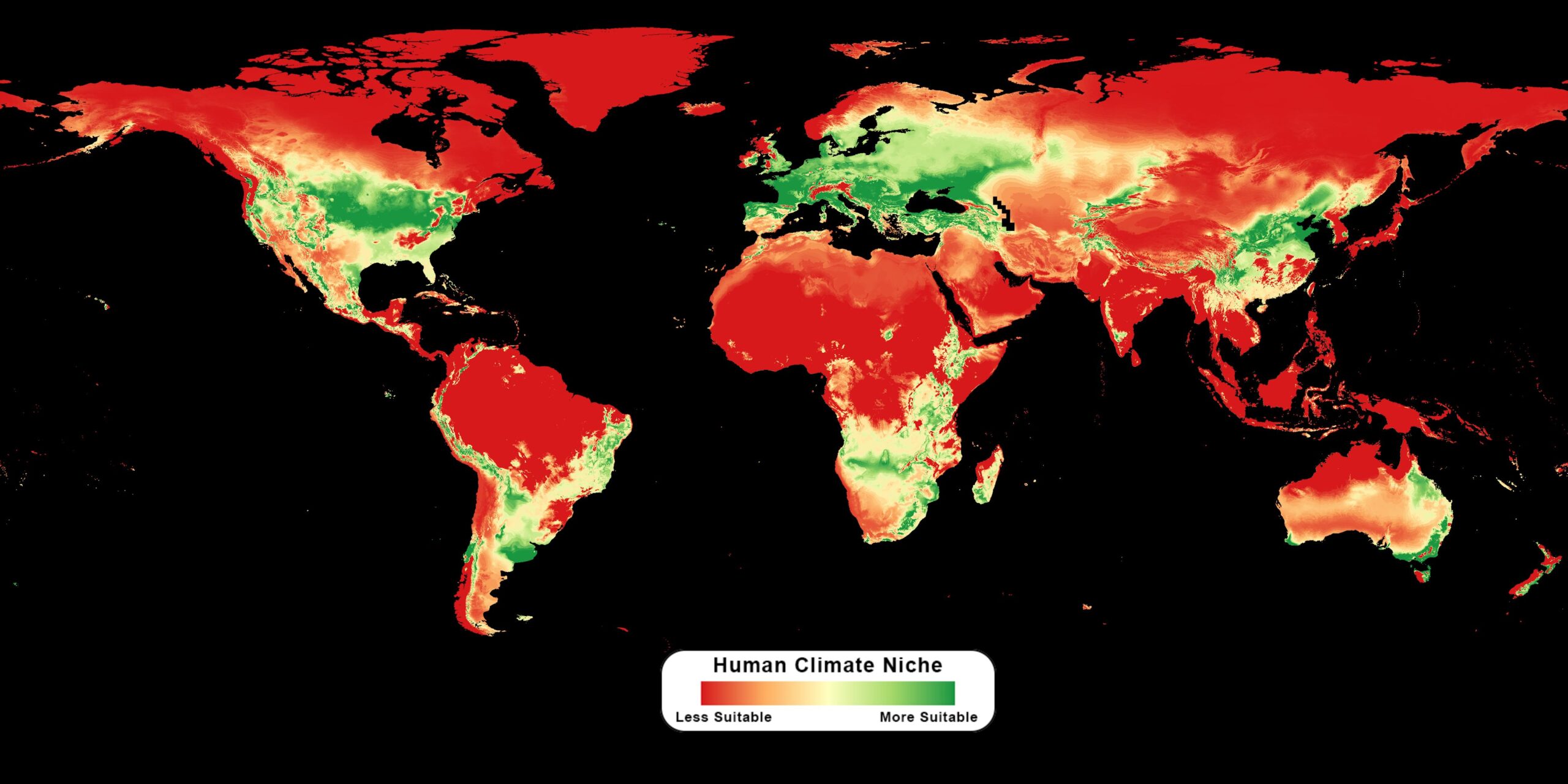
Human Climate Niche 2020 & 2070
Title: Human Climate Niche 2020 & 2070
The human climate niche are areas on Earth where humans have historically lived due to favorable climate conditions related to temperature and precipitation. For the past 6000 years, humans have mostly lived in the same climate conditions as they do now. In addition to humans, this climate niche is also where the production of crops and livestock typically takes place. The optimal mean annual temperature of this identified niche is around 52 °F to 59 °F (∼11 °C to 15 °C). But as the climate changes, the areas that fit within the human climate niche will change as well. This dataset identifies the current human climate niche, with land shaded to show which areas are more or less suitable for people, and then projects the future human climate niche in 2070 based on the climate projection scenario of RCP 8.5. Also included as an additional layer that can be turned on and off is a map that shows the areas where the mean annual temperature is greater than 84 °F (29 °C). Currently, only 0.8% of the global land surface has a mean annual temperature greater than 84 °F, but in 2070 that is projected to cover 19% of the global land and impact an estimated 3.5 billion people. According to the researchers who developed this dataset, “The bottom line is that over the coming decades, the human climate niche is projected to move to higher latitudes in unprecedented ways. At the same time, populations are projected to expand predominantly at lower latitudes, amplifying the mismatch between the expected distribution of humans and the climate.” The researchers estimate that roughly 30% of the projected global population would have to move if people were to live in the human climate niche as they do now. They further suggest that “each degree of temperature rise above the current baseline roughly corresponds to one billion humans left outside the temperature niche, absent migration” for the socioeconomic SSP3 scenario. Map - 2020 (4096x2048) Dataset Sources: PNAS Future of Human Climate Niche Applicable Metadata: Category: Forests, Biosphere, Ecosystem, Human Impact Related Lessons/Units: Mapping Human Impacts: Human Activity and the Environment Related Data: Link(s)- (TBD) Link to Source: NOAA Science On a Sphere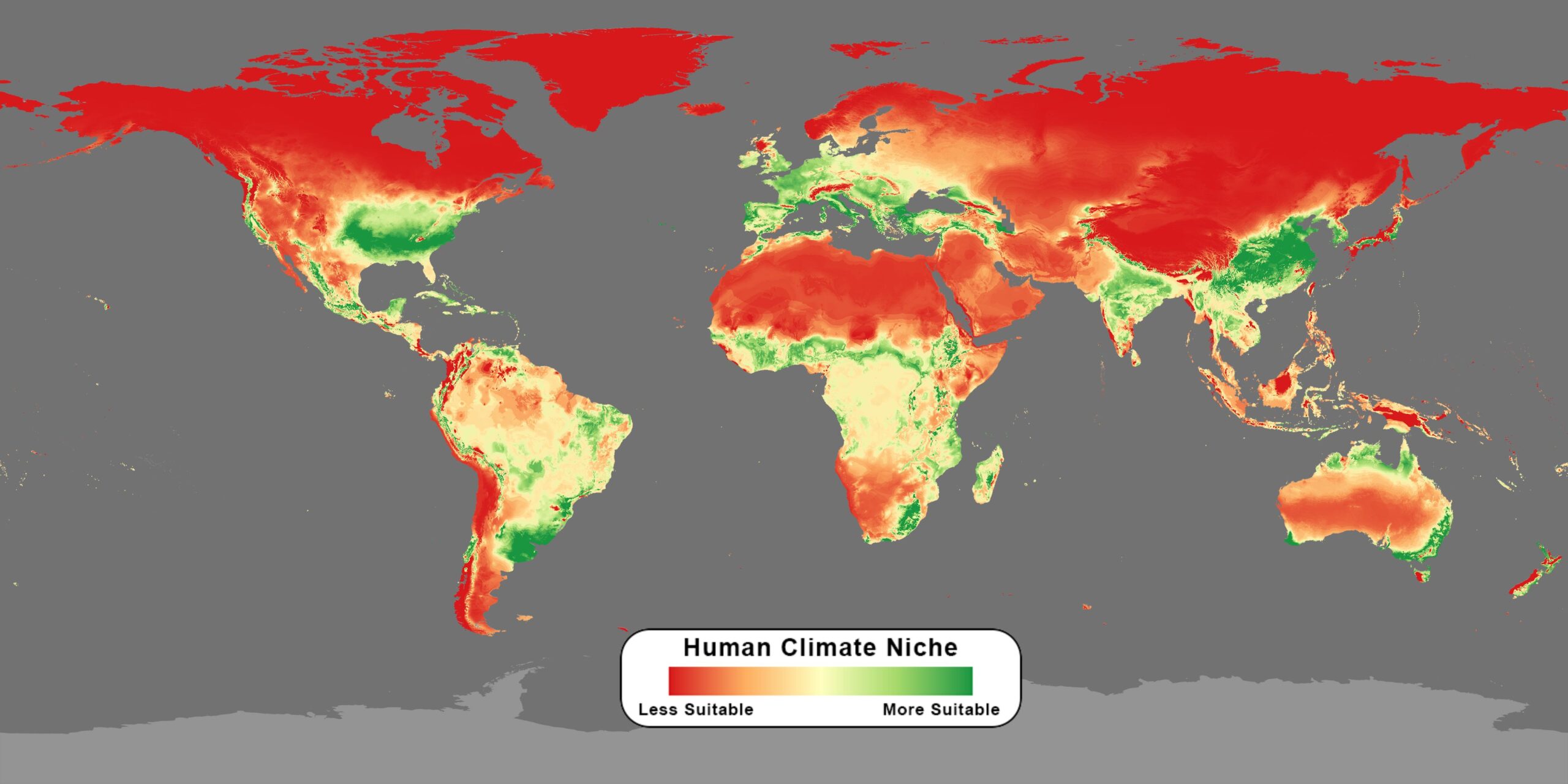
Map 2020 with Colorbar
Colorbar
Map - 2070 (4096x2048)
Map - 2070 with Colorbar
Light Pollution - Artificial Sky Brightness
Title: Light Pollution - Artificial Sky Brightness
Light pollution in urban centers creates a sky glow that can blot out the stars. The brighter the area in this map the harder it is to see stars and constellations in the night sky. The Milky Way, the brilliant river of stars that has dominated the night sky and human imaginations since time immemorial, is just a faded memory for one third of humanity and 80 percent of Americans, according to a new global atlas of light pollution produced by Italian, Israeli, and American scientists. “We’ve got whole generations of people in the United States who have never seen the Milky Way,” said Chris Elvidge, a scientist with NOAA’s National Centers for Environmental Information. “It’s a big part of our connection to the cosmos—and it’s been lost.” The artificial sky brightness levels are those used in legend and indicate the following: up to 1% above the natural light (black); from 1 to 8% above the natural light (blue); from 8 to 50% above natural nighttime brightness (green); from 50% above natural to the level of light under which the Milky Way is no longer visible (yellow); from Milky Way loss to estimated cone stimulation (red); and very high nighttime light intensities, with no dark adaption for human eyes (white). For the purpose of this atlas, we set the level of artificial brightness under which a sky can be considered “pristine” at 1% of the natural background. The dark gray level (1 to 2%) sets the point where attention should be given to protect a site from a future increase in light pollution. Blue (8 to 16%) indicates the approximate level where the sky can be considered polluted on an astronomical point of view. The winter Milky Way (fainter than its summer counterpart) cannot be observed from sites coded in yellow, whereas the orange level sets the point of artificial brightness that masks the summer Milky Way as well. In areas that appear red, people never experience conditions resembling a true night because it is masked by an artificial twilight. To learn more about this map, read the Science Advances paper. Also available is a book entitled, The World Atlas of Light Pollution Map - 4096 x 2048 Dataset Sources: Global Forest Watch Applicable Metadata: Category: Human Impact, Human Population Related Lessons/Units: Mapping Human Impacts: Human Activity and the Environment Related Data: Link(s)- (TBD) Link to Source: NOAA Science On a Sphere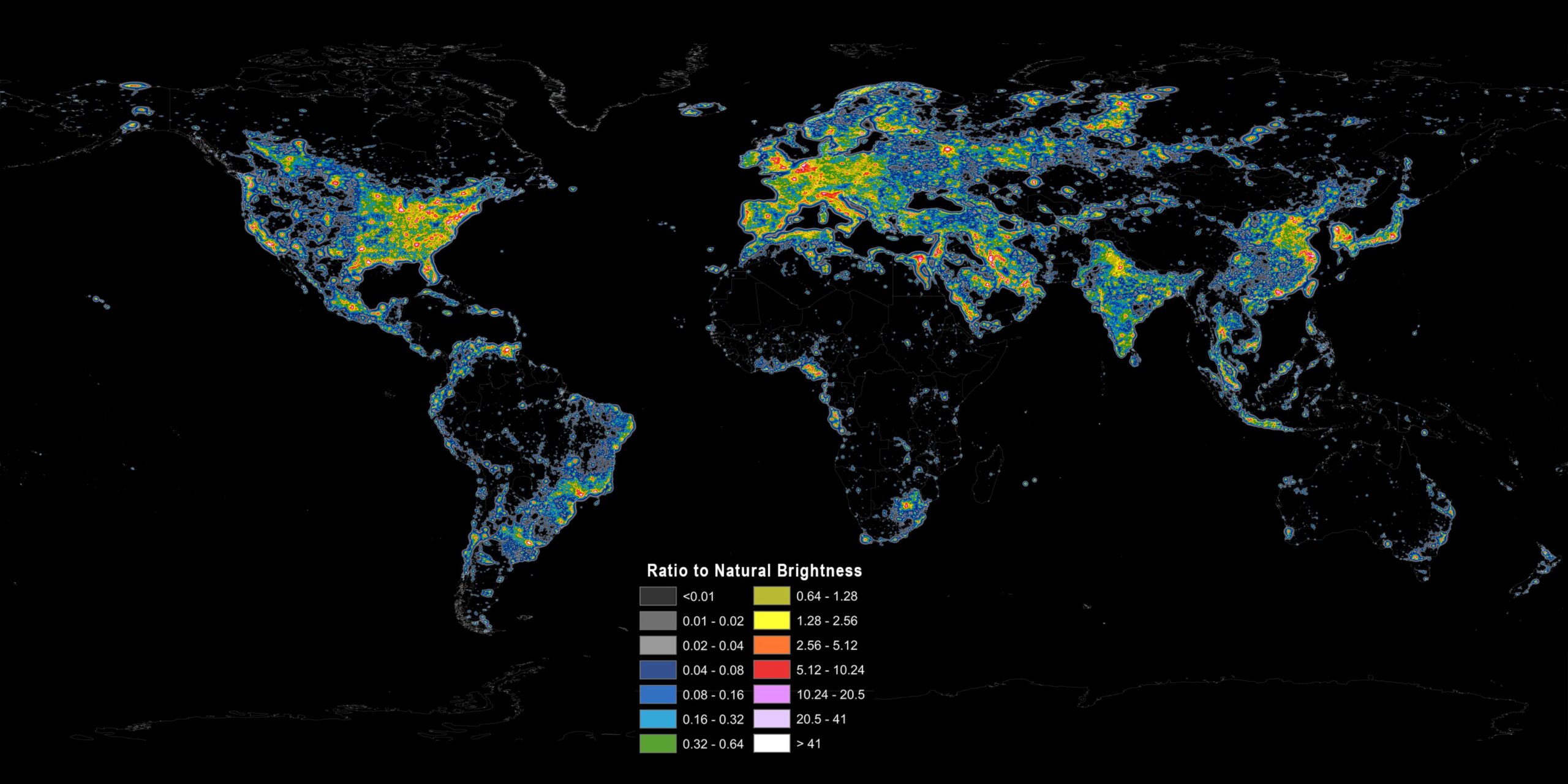
Map with Colorbar
Legend
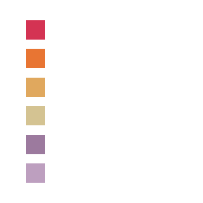
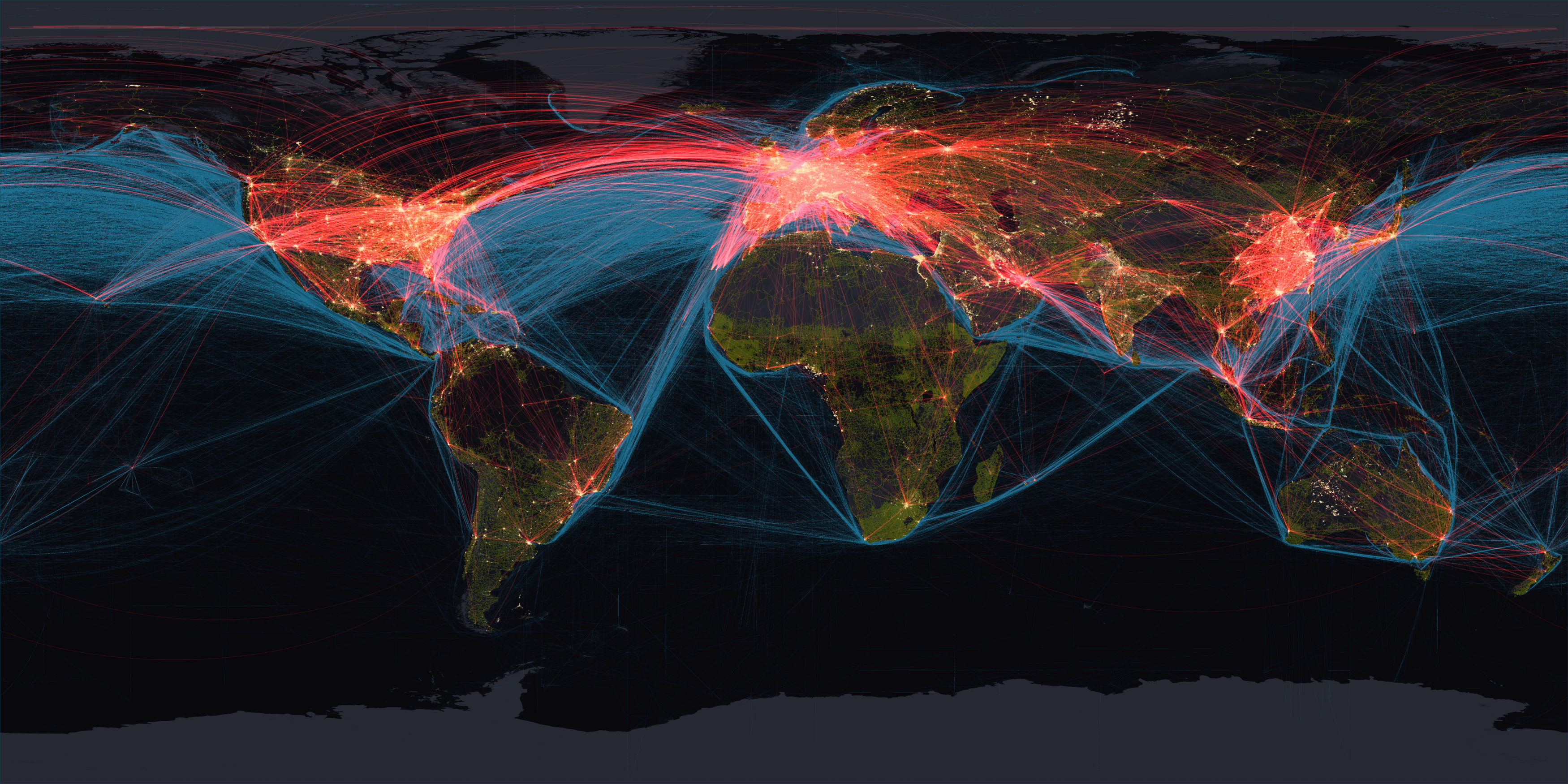
Human Transportation
Title: Human Transportation
This image of the Nighttime Lights - 2012 is combined with data showing the human footprint of global transportation on land, in the air, and by sea. The base map of this image shows nighttime lights visible from space, which indicates areas where people live, work, and consume energy. Red lines represent 87,000 daily flights connecting cities and cultures around the world. Blue lines represent the paths of 3500 commercial vessels over the course of a year, which is only 10% of the total ocean shipping traffic. Green lines represent the world's roads, used by over 1 billion motor vehicles. This colorful globe shows the interconnected nature of the world, but also how much energy we use to move people and goods around the planet's surface. It's important to note that the nighttime lights data includes all lights at night, not just electricity; for example, both natural and man-made fires as well as gas flaring from fossil fuel extraction can be seen in places like west central Australia, West Africa, and Siberia. Dataset Sources: Applicable Metadata: Category: Human Impact, Transportation, Climate Change Related Lessons/Units: Mapping Human Impacts: Human Activity and the Environment Related Data: Link(s)- (TBD) Link to Source: NOAA Science On a Sphere![]()
Map with Colorbar
Vegetation - December 2022
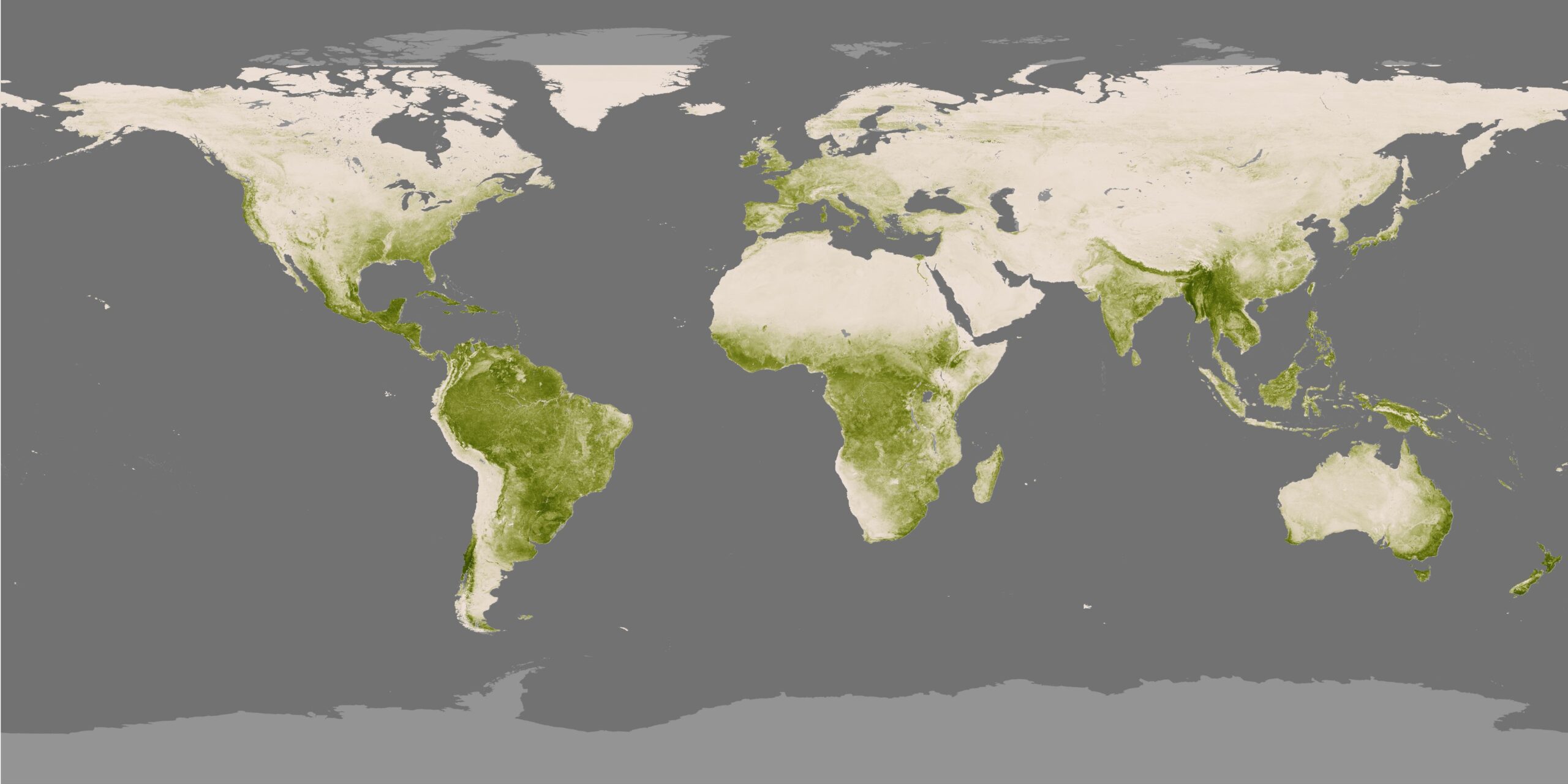
Title: Vegetation - December 2022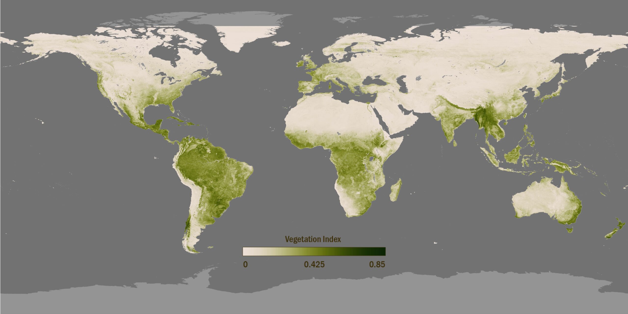
Although 75% of the planet is a relatively unchanging ocean of blue, the remaining 25% of Earth's surface is a dynamic green. Data from the NOAA-20 polar orbiting satellite is able to show these subtle differences in greenness using the Visible-Infrared Imager/Radiometer Suite (VIIRS) instrument on board the satellite. This dataset highlights our ever-changing planet in real-time, using a highly detailed vegetation index data from the satellite, developed by scientists at NOAA. The darkest green areas are the lushest in vegetation and absorb the most visible sunlight, while the pale colors are sparse in vegetation cover either due to snow, drought, rock, or urban areas. VIIRS detects changes in the reflection of visible light, producing images that measure changes to vegetation over time. There is one image from the satellite data for every week in the last year for this animations. The VIIRS measures vegetation at four times the resolution compared to earlier satellite instruments, resulting in greater clarity and definition of the final imagery. This vegetation data will be incorporated into many NDVI-based products and services, including weather and environmental prediction models, and the U.S. Drought Monitor. Additionally, NOAA's vegetation data are used by other organizations and federal agencies, including the U.S. Department of Agriculture and U.S. Geological Survey for agricultural predictions and assessments. Map - 4096 x 2048 Dataset Sources: NOAA View Global Data Explorer Applicable Metadata: Monthly average - December 2022 Category: Seasons, photosynthesis, forests, chlorophyll, drought, water, agriculture Related Lessons/Units: Mapping Human Impacts: Human Activity and the Environment Related Data: Link(s)- (TBD) Link to Source: NOAA Science On a Sphere
Map with Legend
Legend
Land Surface Temperature at Night - December 2022
Title: Land Surface Temperature at Night - December 2022
The maps shown here were made using data collected during the nighttime by the Moderate Resolution Imaging Spectroradiometer (MODIS), an instrument on NASA's Terra and Aqua satellites. Please note that the type of "surface" MODIS measures varies as a function of location. In some places, the measurement represents the skin temperature of the bare land surface. In other places, the temperature represents the skin temperature of whatever is on the land-including snow and ice, or the leafy canopy of forests and crop fields, or human-made structures such as pavement and building rooftops. (So these maps should not be confused with the surface air temperature values that given in typical weather reports.) Scientists monitor land surface temperature because the warmth rising off Earth's landscapes influences our world's weather and climate patterns. Likewise, land surface temperature is also influenced by changes in weather and climate patterns. So scientists routinely produce such maps to better understand the relationships between land surface temperature and changing weather and climate patterns. In particular, scientists want to monitor how the increase in atmospheric greenhouse gases impacts land surface temperature. Scientists are also interested to track where and how glaciers, ice sheets, and permafrost regions are changing as land surface temperatures change. Commercial farmers may also use land surface temperature maps like these to evaluate water requirements for their crops during the summer, when they are prone to heat stress. Conversely, in winter such maps can help citrus farmers to determine where and when orange groves were exposed to damaging frost. It's important to note that the nighttime lights data includes all lights at night, not just electricity; for example, both natural and man-made fires as well as gas flaring from fossil fuel extraction can be seen in places like west central Australia, West Africa, and Siberia. Map - 4096 x 2048 Dataset Sources: Applicable Metadata: Monthly average December 2022 Category: Temperature, Nighttime, Seasons, Diurnal Related Lessons/Units: Mapping Human Impacts: Human Activity and the Environment Linda Related Data: Link(s)- (TBD) Link to Source: NASA Earth Observations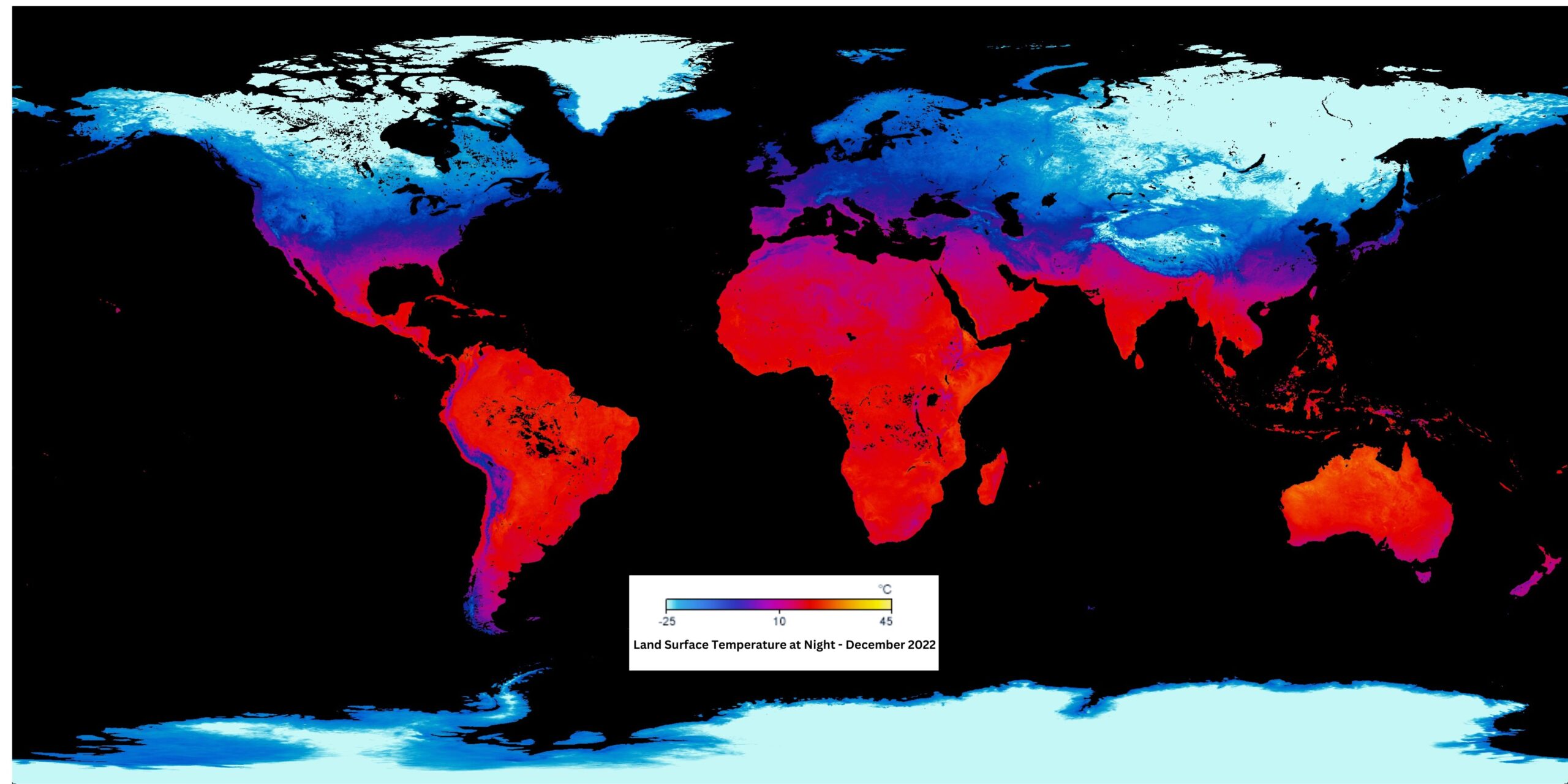
Map with Colorbar
Colorbar
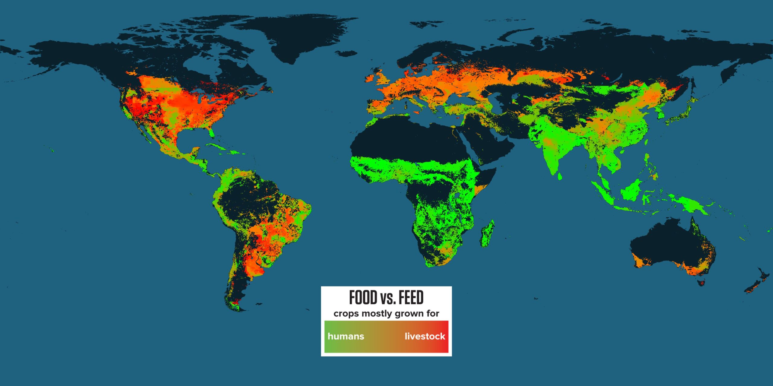
Agriculture: Food vs. Feed
Title: Agriculture: Food vs Feed
Not all cropland is used for producing food directly for people. A lot of the food crops grown are actually used as feed for animals. This map shows which regions produce crops that are mostly consumed directly by humans (in green), which regions produce about the same amount of human food and animal feed (in orange), and where most of the crops are used as animal feed (in red). the conversion of crops to meat is not particularly efficient (in the case of cattle, for example, about 30 pounds of feed are needed to grow a single pound of beef), so as global demand for meat rises, cropland devoted to growing animal feed will have to increase proportionately. What effect will this have on the cost of meat, crops, and our diets? Dataset Sources: University of Minnesota Institute on the Environment Applicable Metadata: Category: Food, Ecosystem, Human Impact, Livestock, Diet Related Lessons/Units: Mapping Human Impacts: Human Activity and the Environment ( Mary Ann’s)) Related Data: Link(s)- (TBD) Link to Source: NOAA Science On a Sphere
Map - 4096 x 2048
Map with Legend
Legend